text by Luca Buttafava and Alessandro Confalonieri

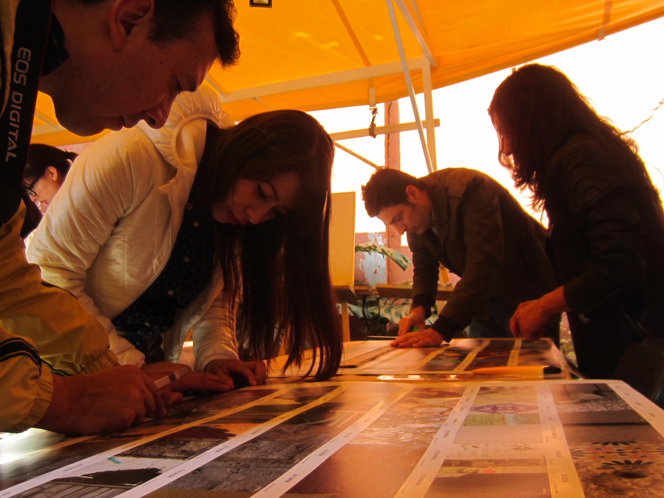
The group of students had three weeks to collect photographic observations from the field in order to document the colours of Milan.
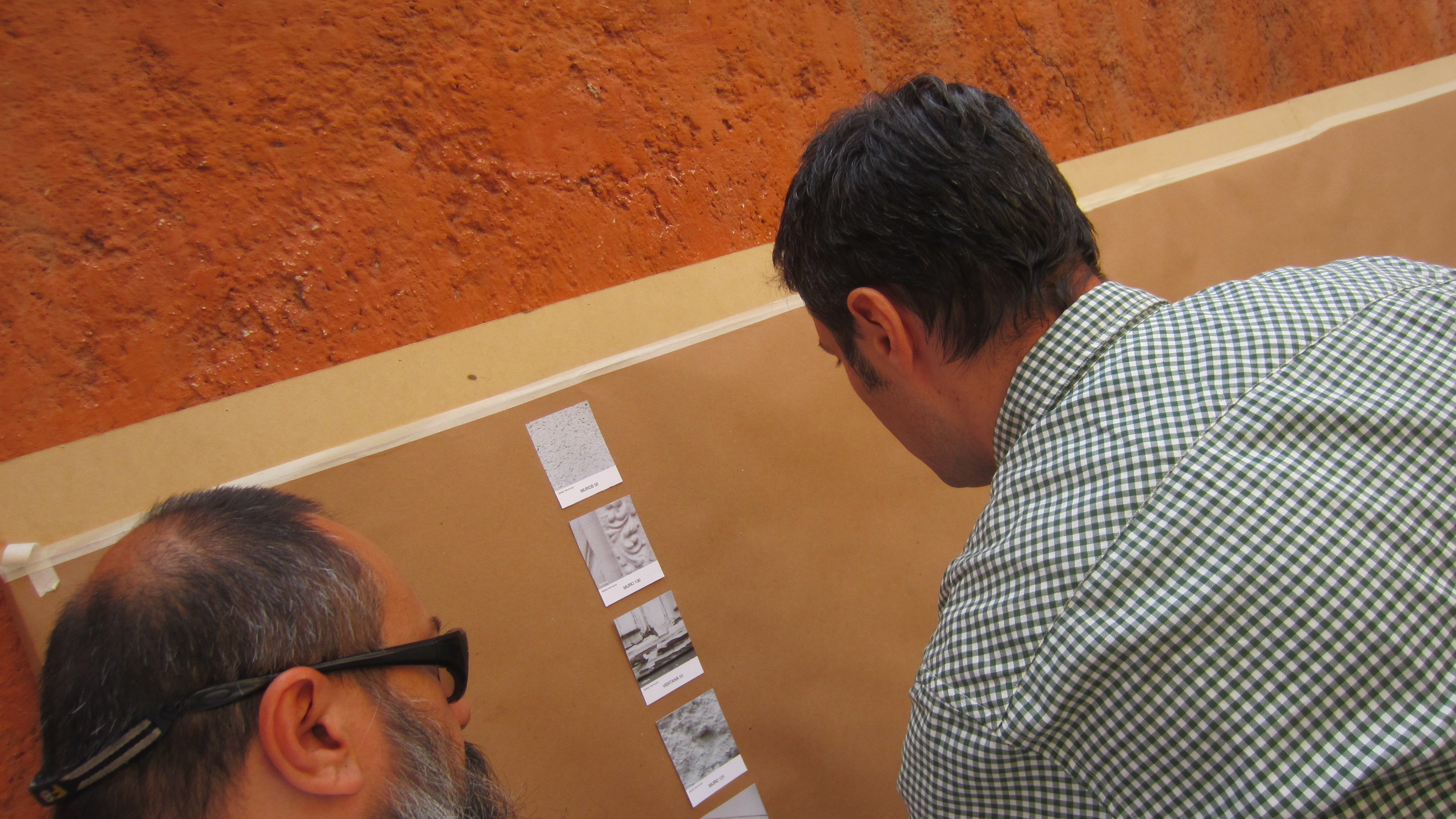
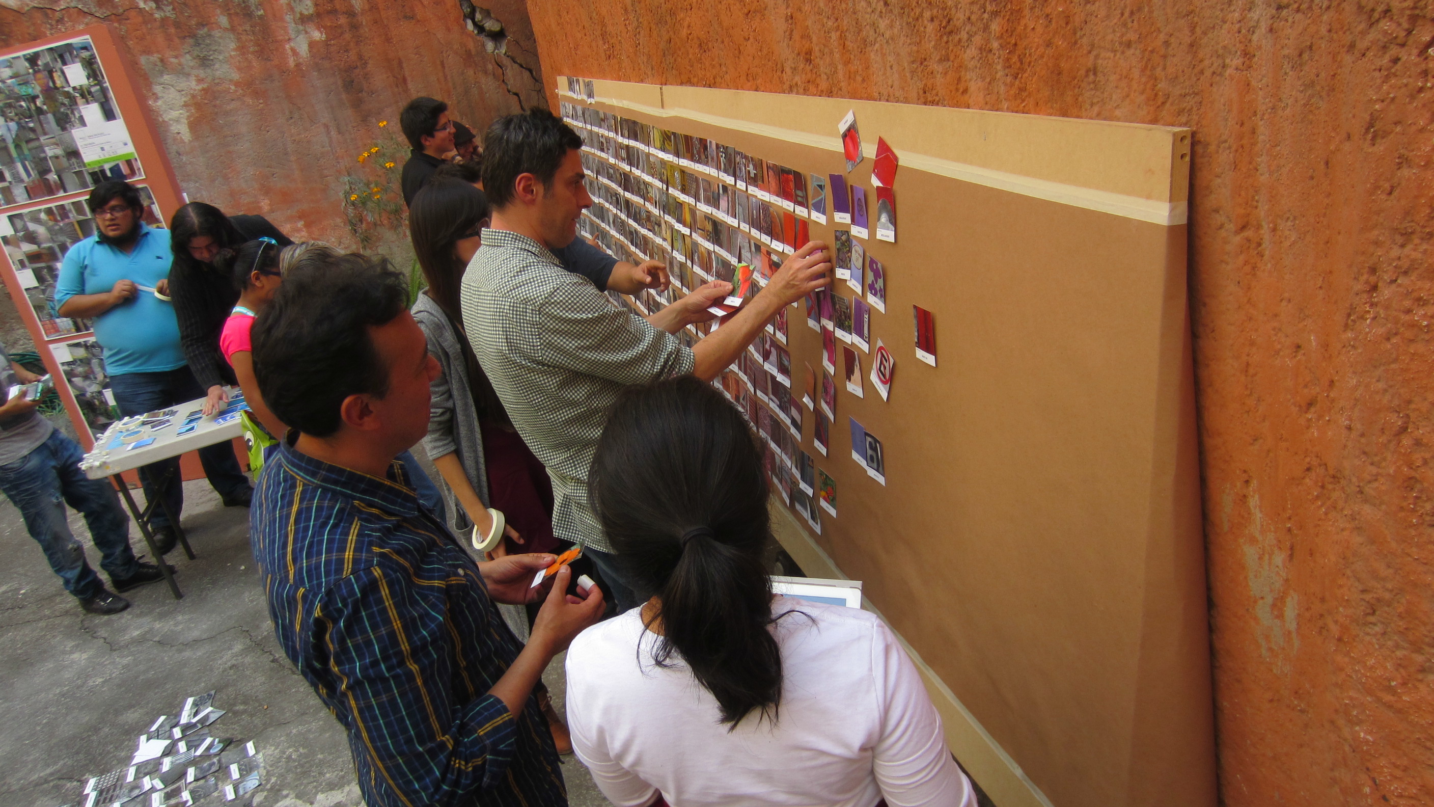
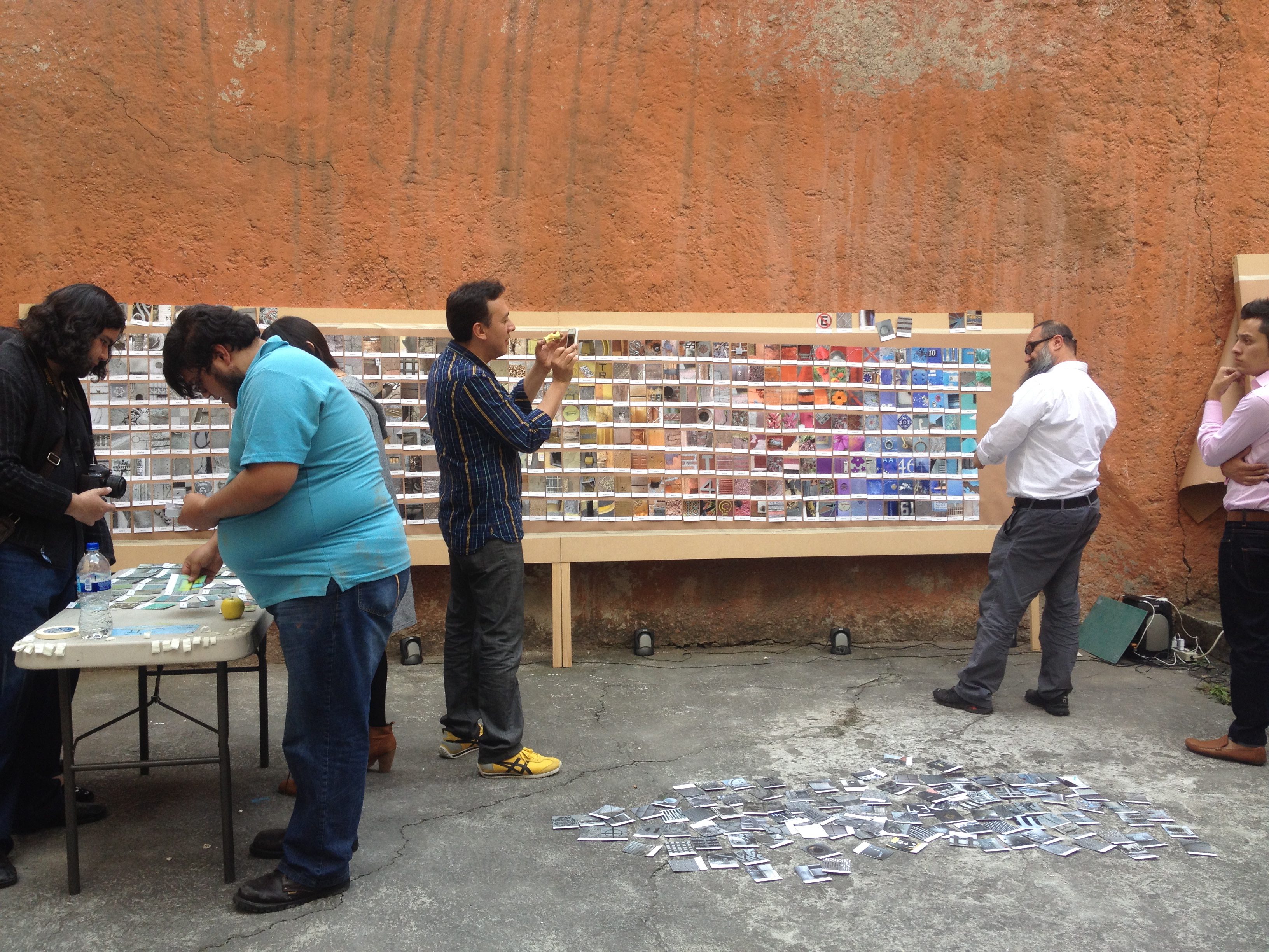
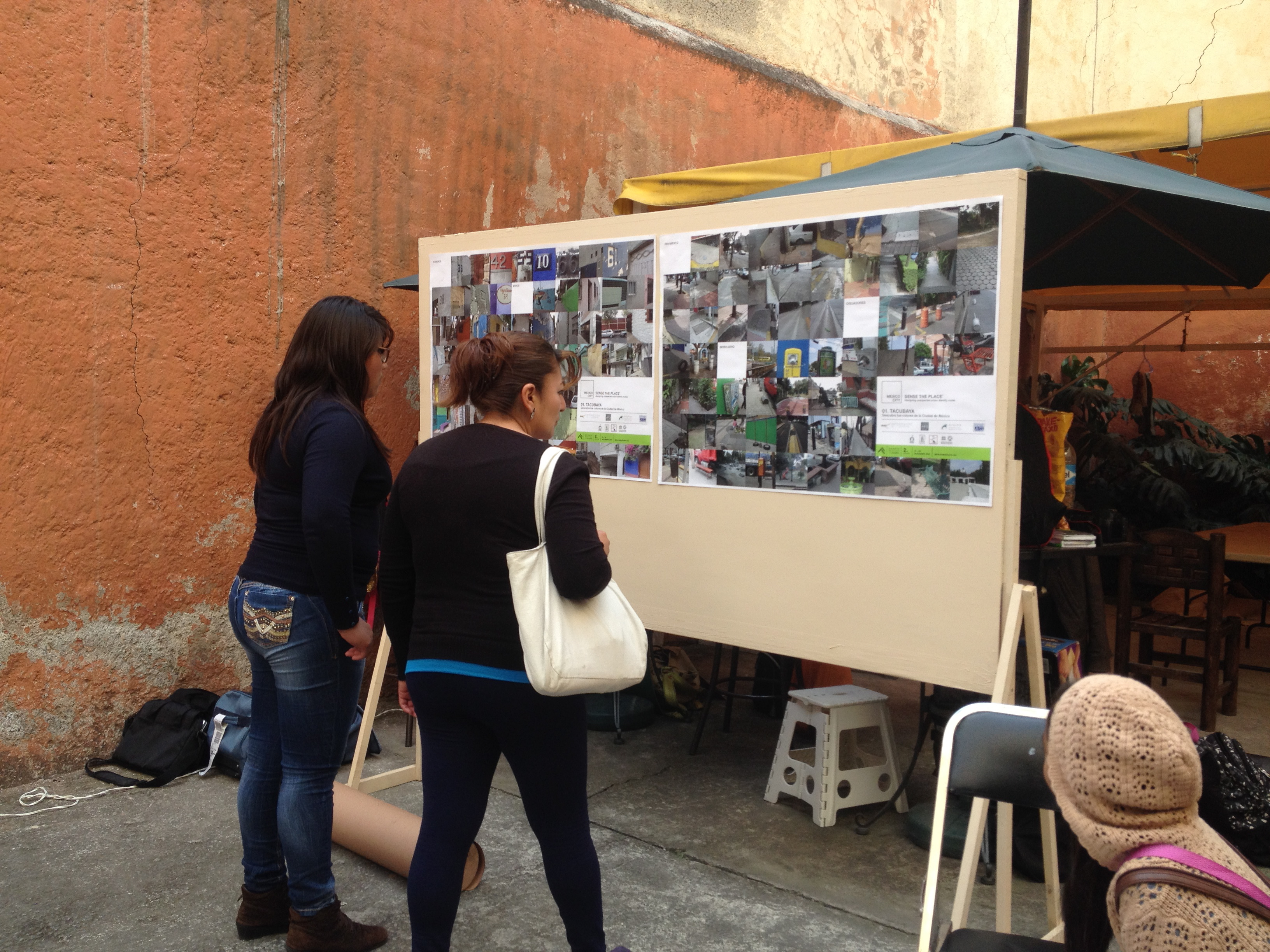
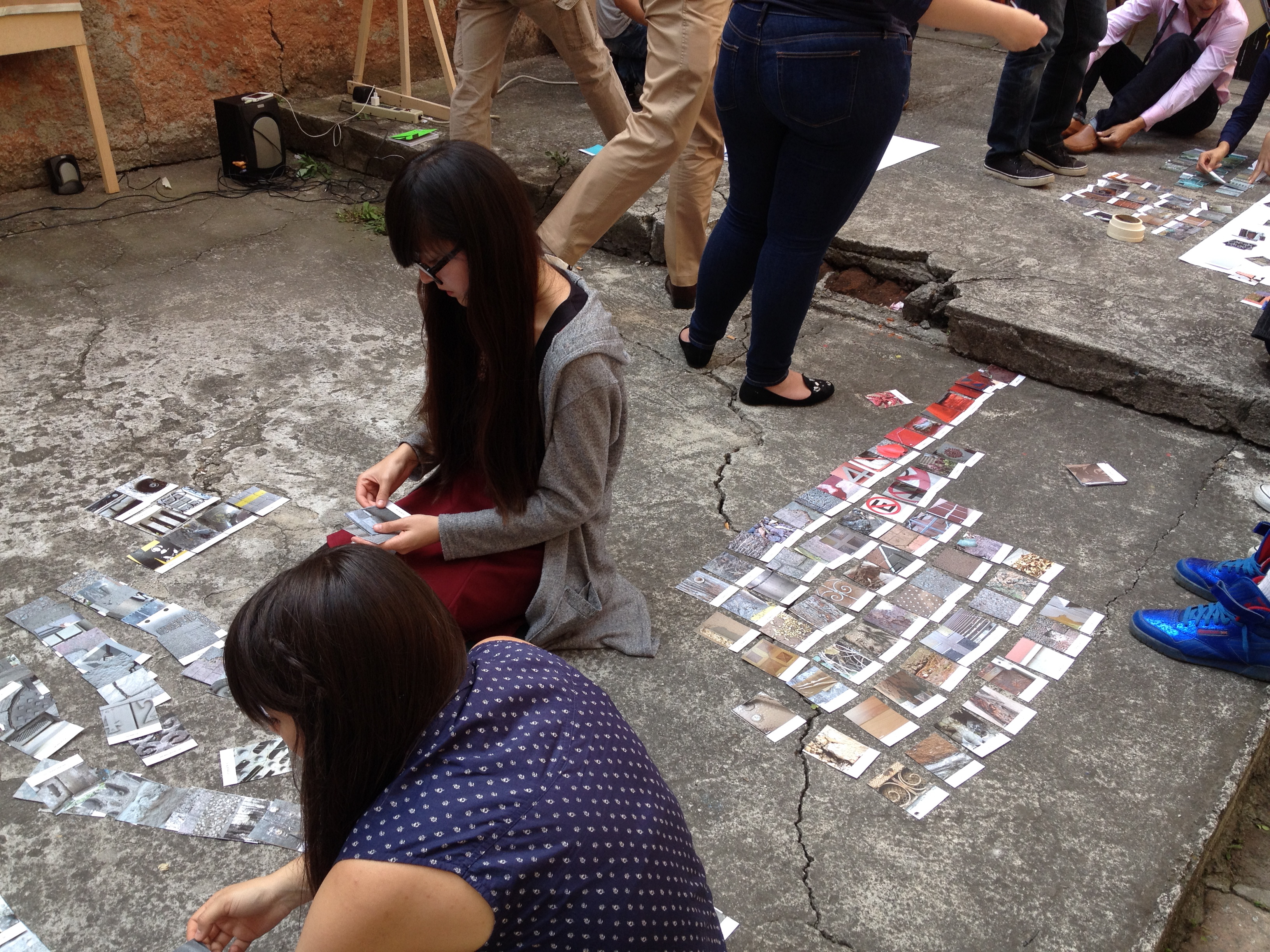
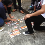
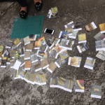
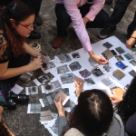
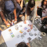
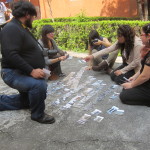
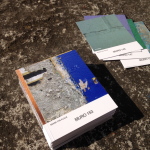
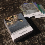
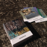
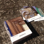
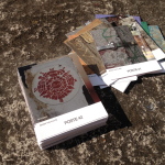
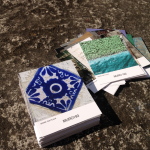
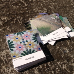
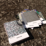
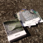
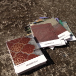
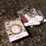
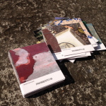
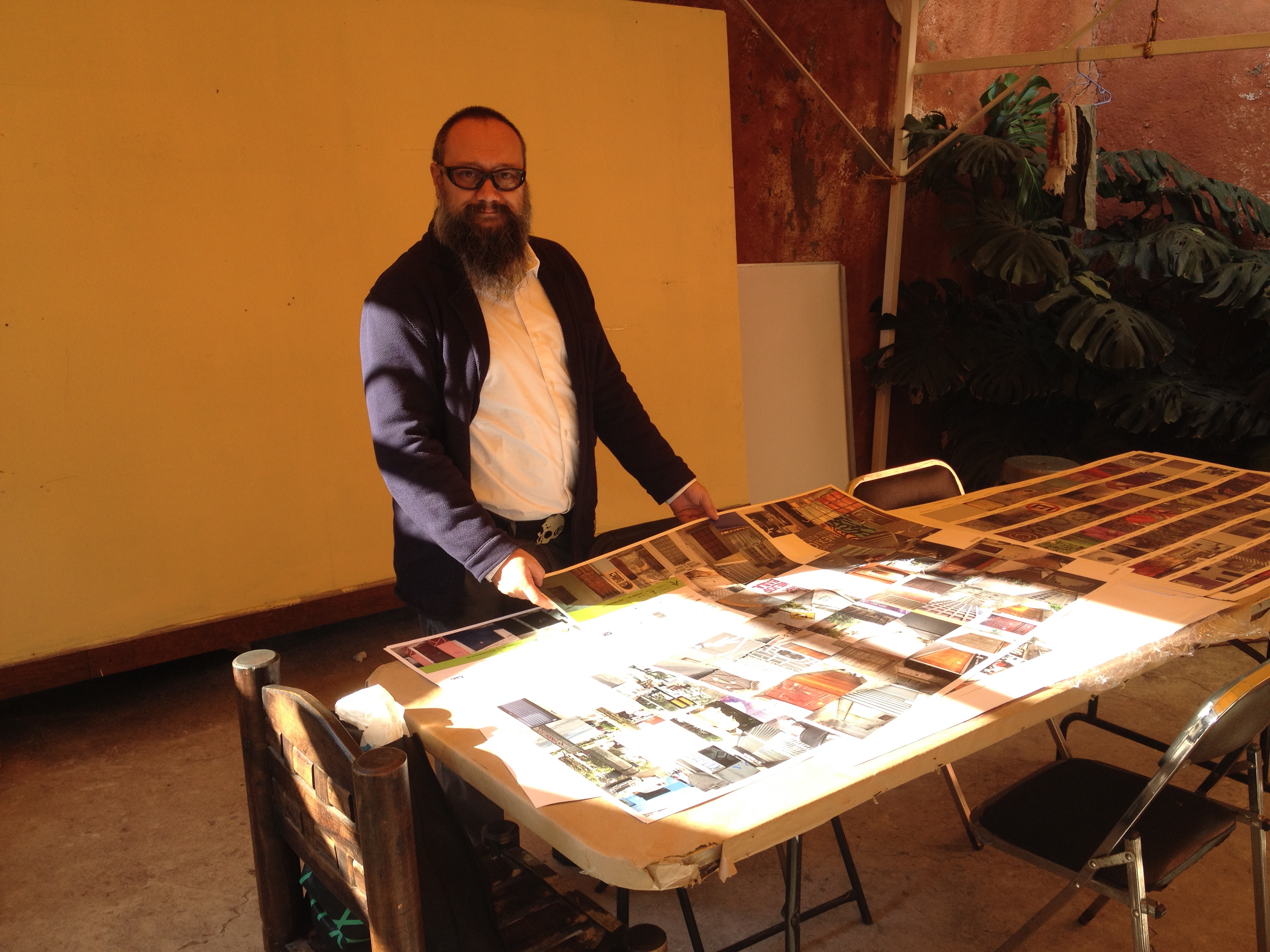
Collection of Photographic material, analysis and final selection.
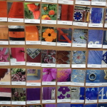
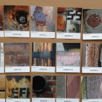
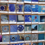
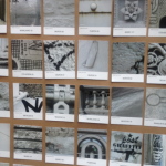
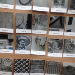
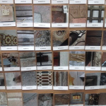
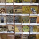
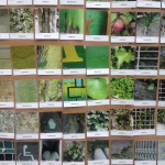
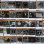
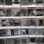
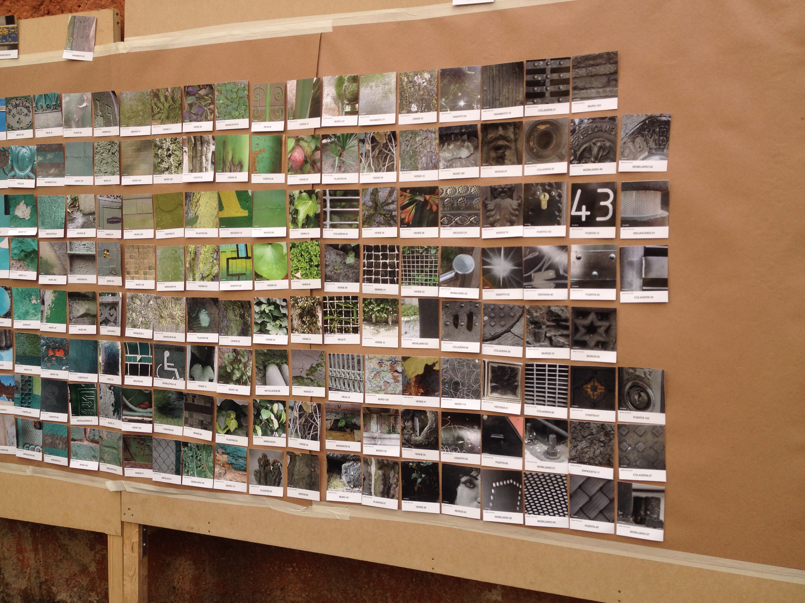
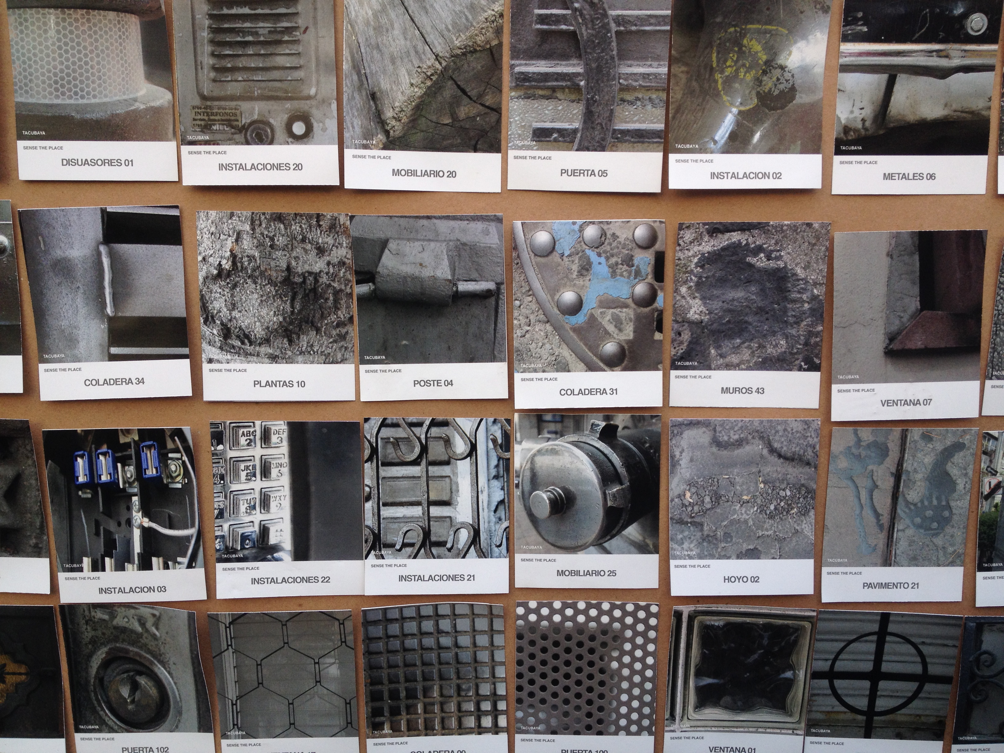
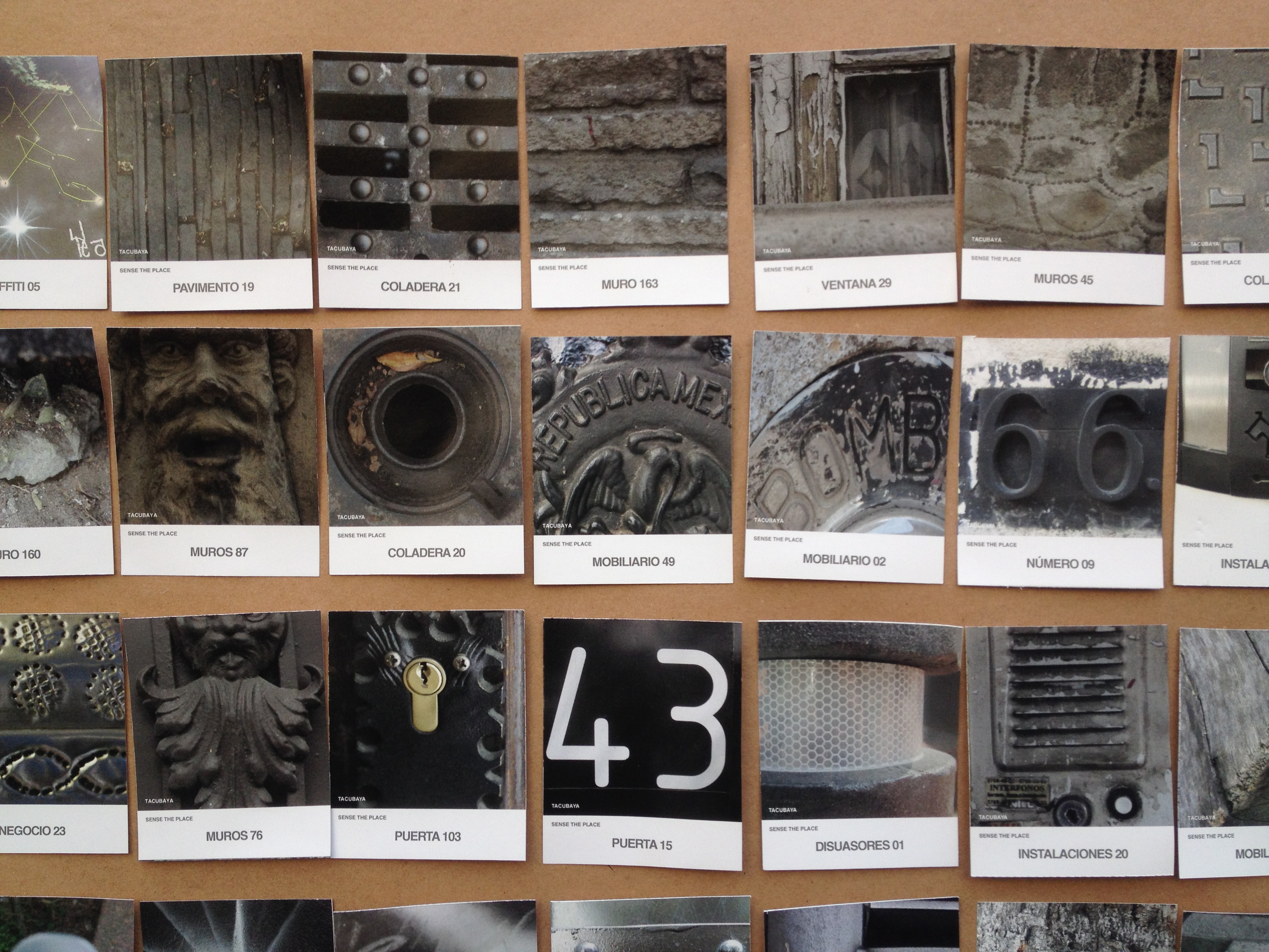
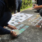
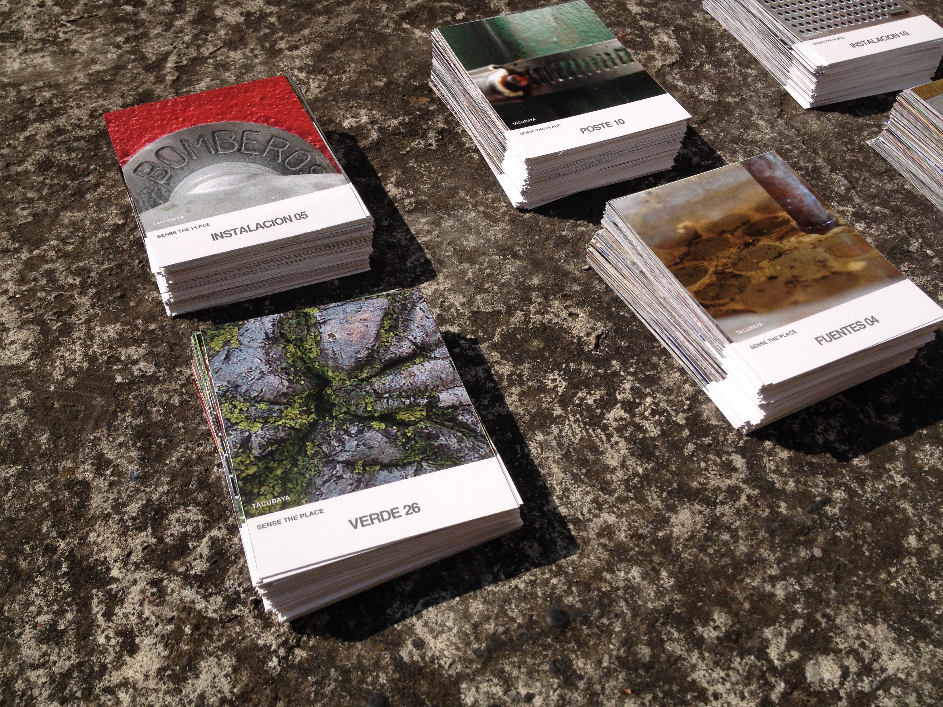
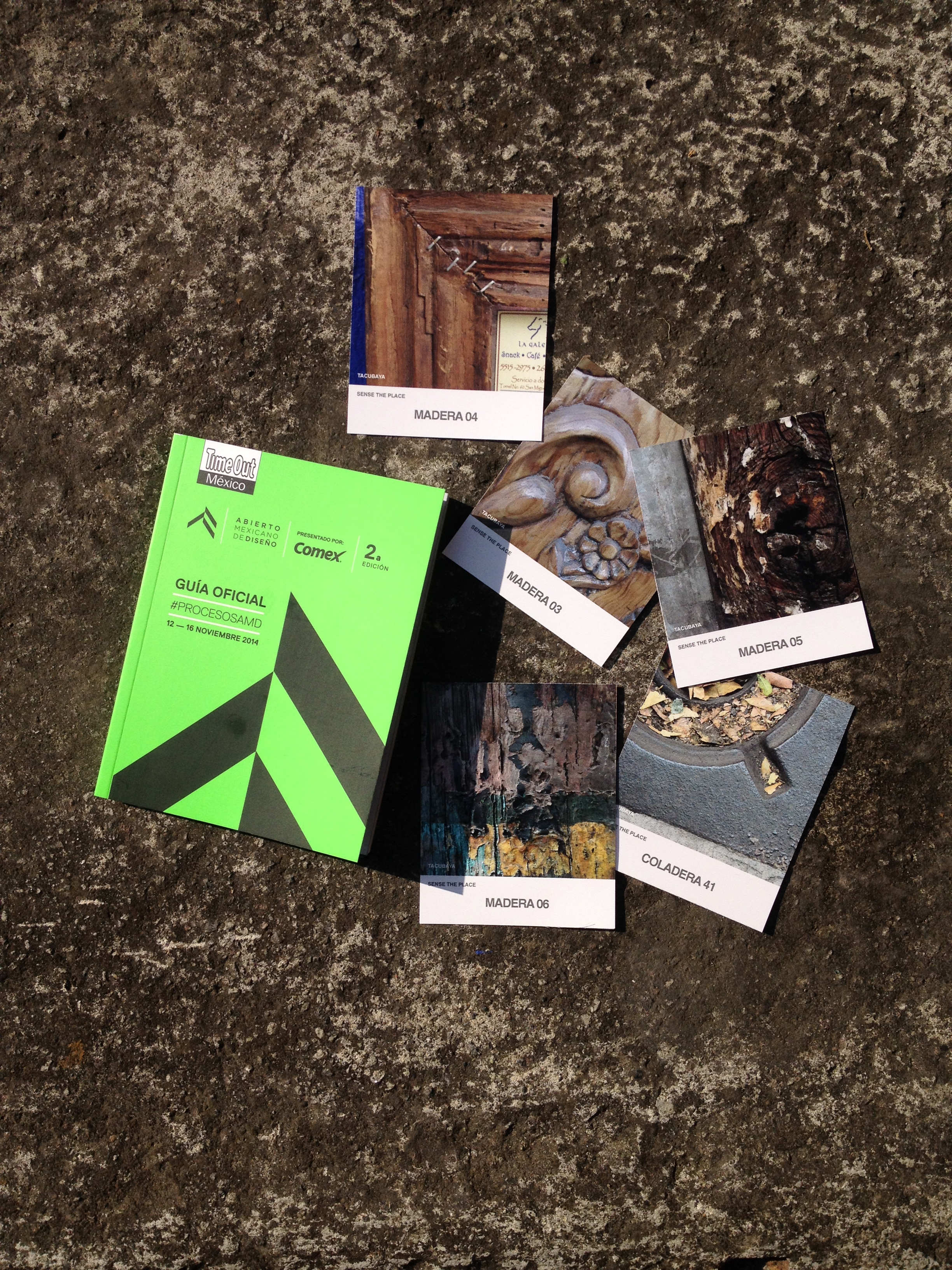
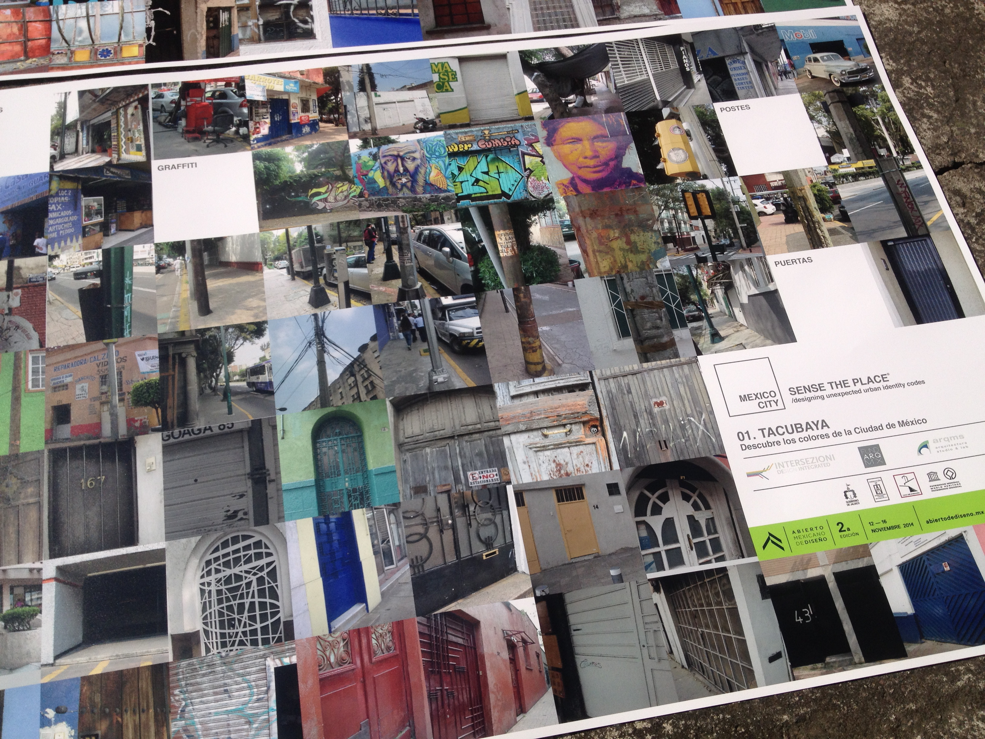
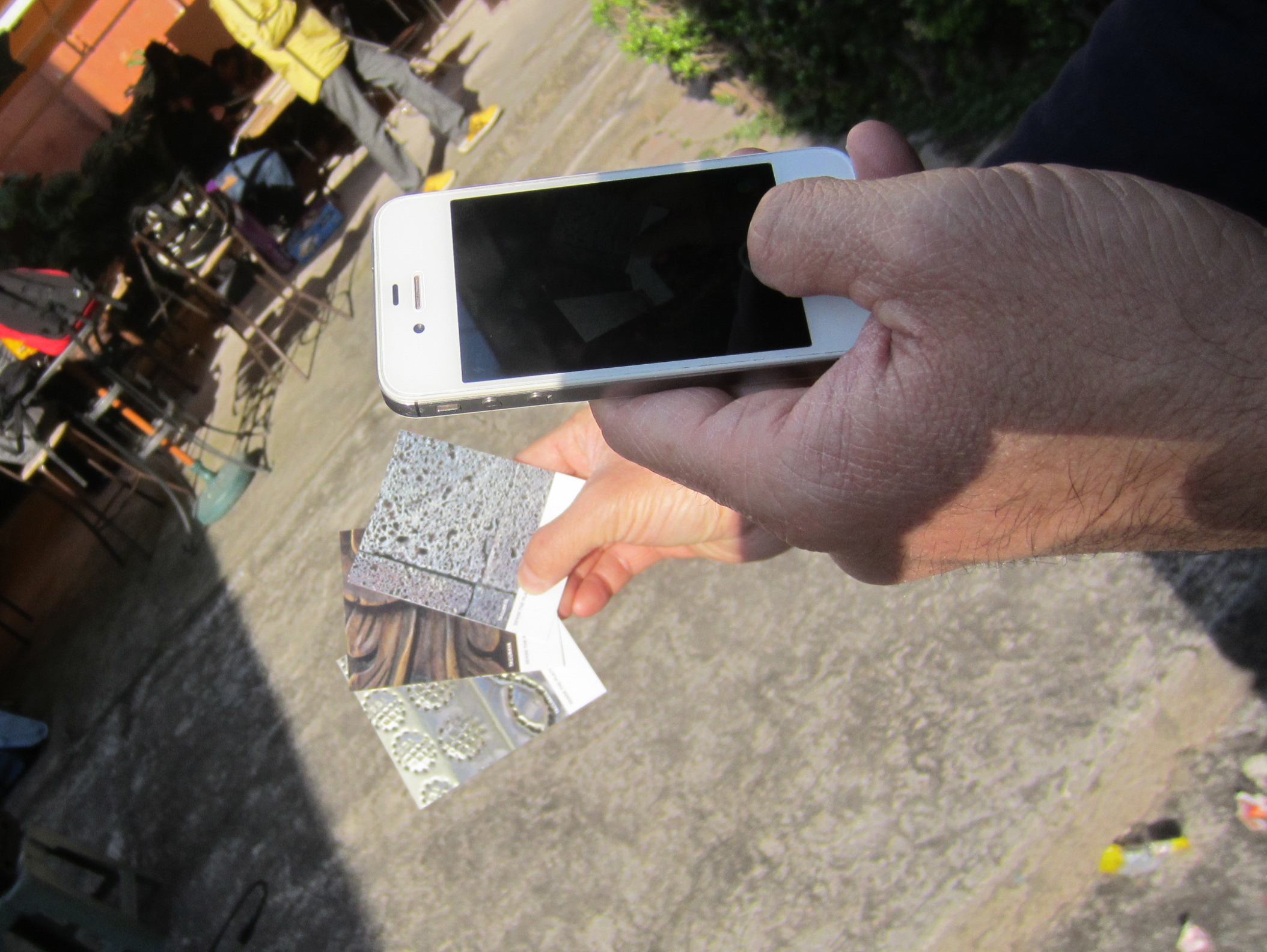
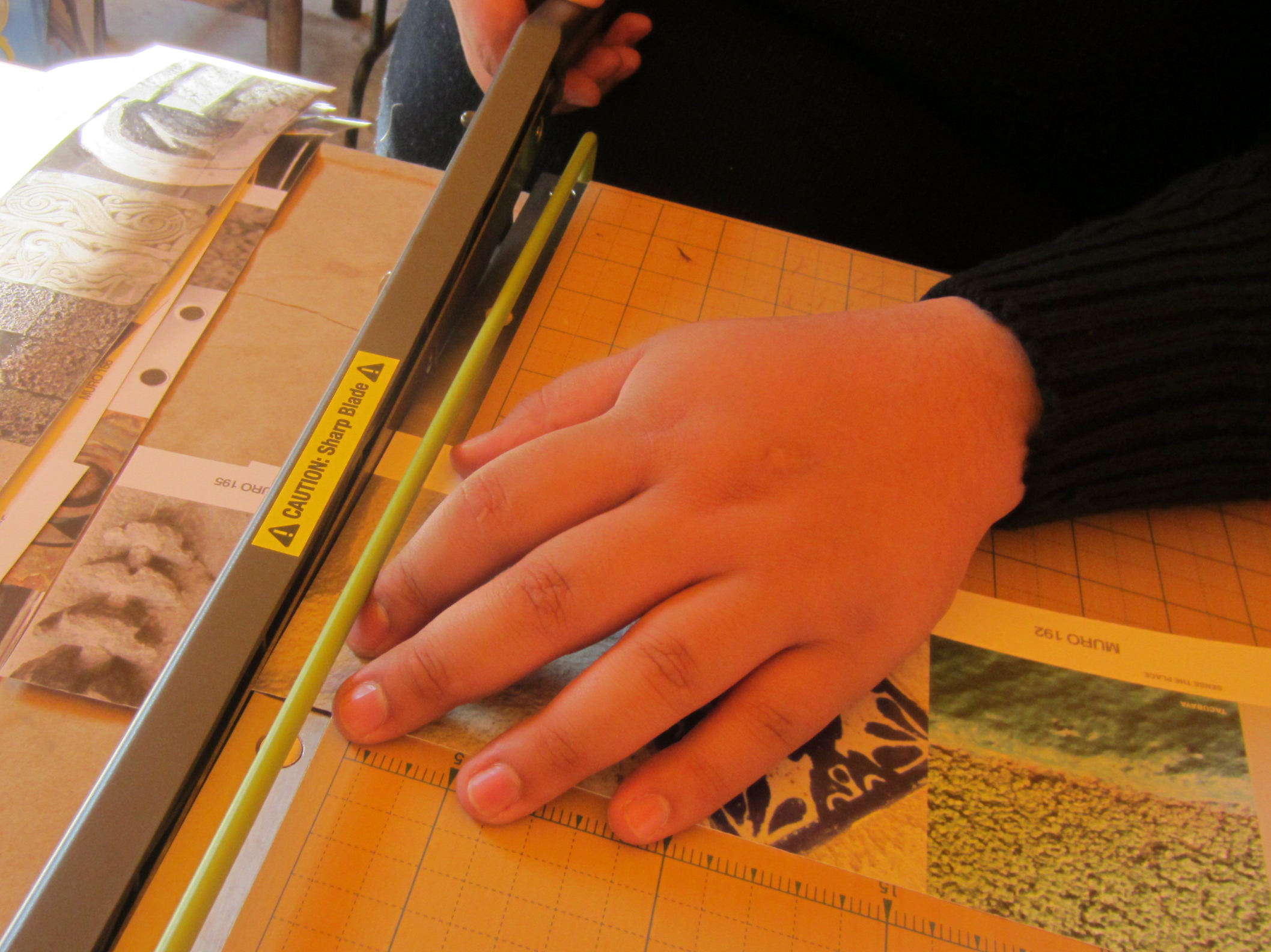
Participants documented each of their observations in its context and then photographed a fragment of the artefact in question, treating it as if it were a single pixel; two photos for each story. Taken as a whole, these “pixel” photos all add up to map out a colour chart of Milan.
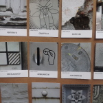
Re-reading the research project and analysing it has lead us to define categories in terms of artefacts. Among the priorities, we set ourselves the objective of telling a story that made sense; we also set ourselves limits and established guidelines.
A reasonable number of categories, very few but well focused shots, lots of feedback and a very selective process.
We have removed many artefacts that were not visible at eye level or difficult to spot, along with cars that would have been overbearing, and individuals with their own identity. We have therefore given plenty of room for the architectural elements and consequently the city to express itself through its forms: from speed bumps to utility poles, from parks to melted asphalt with its accumulated recorded memory, and on to carved stones that are incorporated into other artefacts, and so on.


By gathering all this unique, concrete and accurate detail, a whole world was unveiled.
The city reveals itself in an original way.
We had never realized to what extent urban space is relentlessly damaged. It is falling to pieces: the roads and the pavements, the flower pots, speed bumps and other objects, all manifest the state of their abandon, the general absence of being “looked after”, piecemeal projects that never get integrated with one another. There is no unique vision of how the city can or should come across. There is no vision of a physical Brand that represents the physical identity of the city. Milan is not only represented by the official graphics or its web portal, but above all it is represented by its “physical” self through its iconic forms, its materials, its details and through the coherence of its artefacts.


Along the roads you come across many objects that are either bent, rusted, piled up, jammed, tattered, or practically fossilized over time, as well as potholes, patching work, and so on. All this “noise” merges with traffic, movement, the frenetic mood of the people, and the force of the city’s architecture and all those distinguishing marks that characterize it. It is only through further analysis that a disjointed picture emerges laboriously. A picture that does not have a lot in common with the elegance of fashion, the genius of design and the beauty of architectural features that belongs to eras long past.


So does Milan have a single colour, or many colours?
Or perhaps no colours at all?
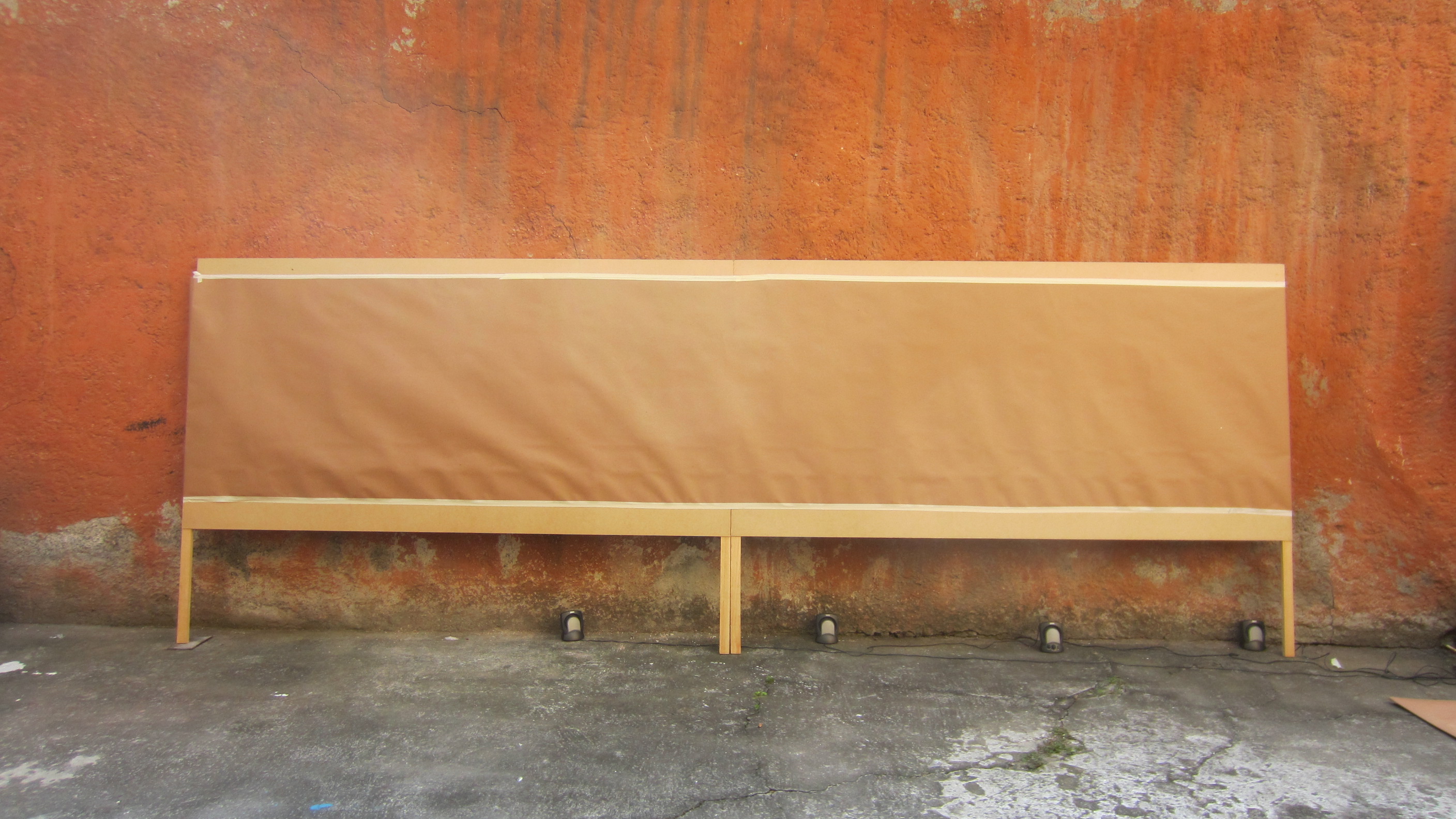
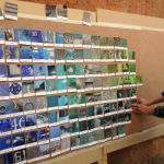
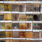
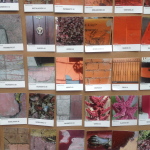
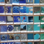
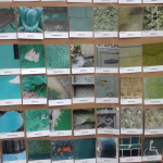
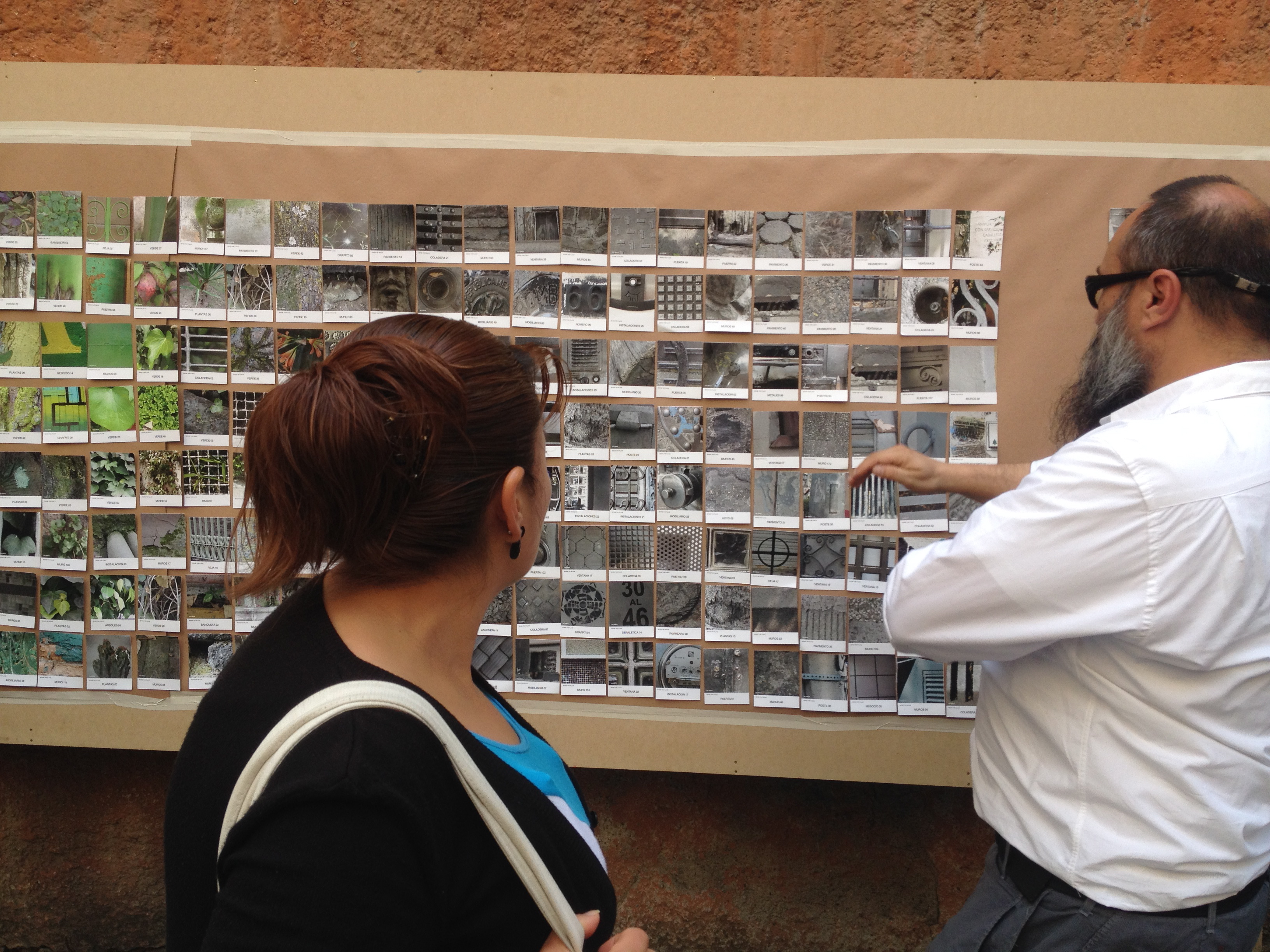
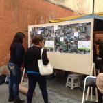
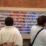
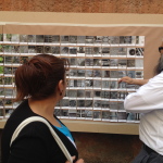
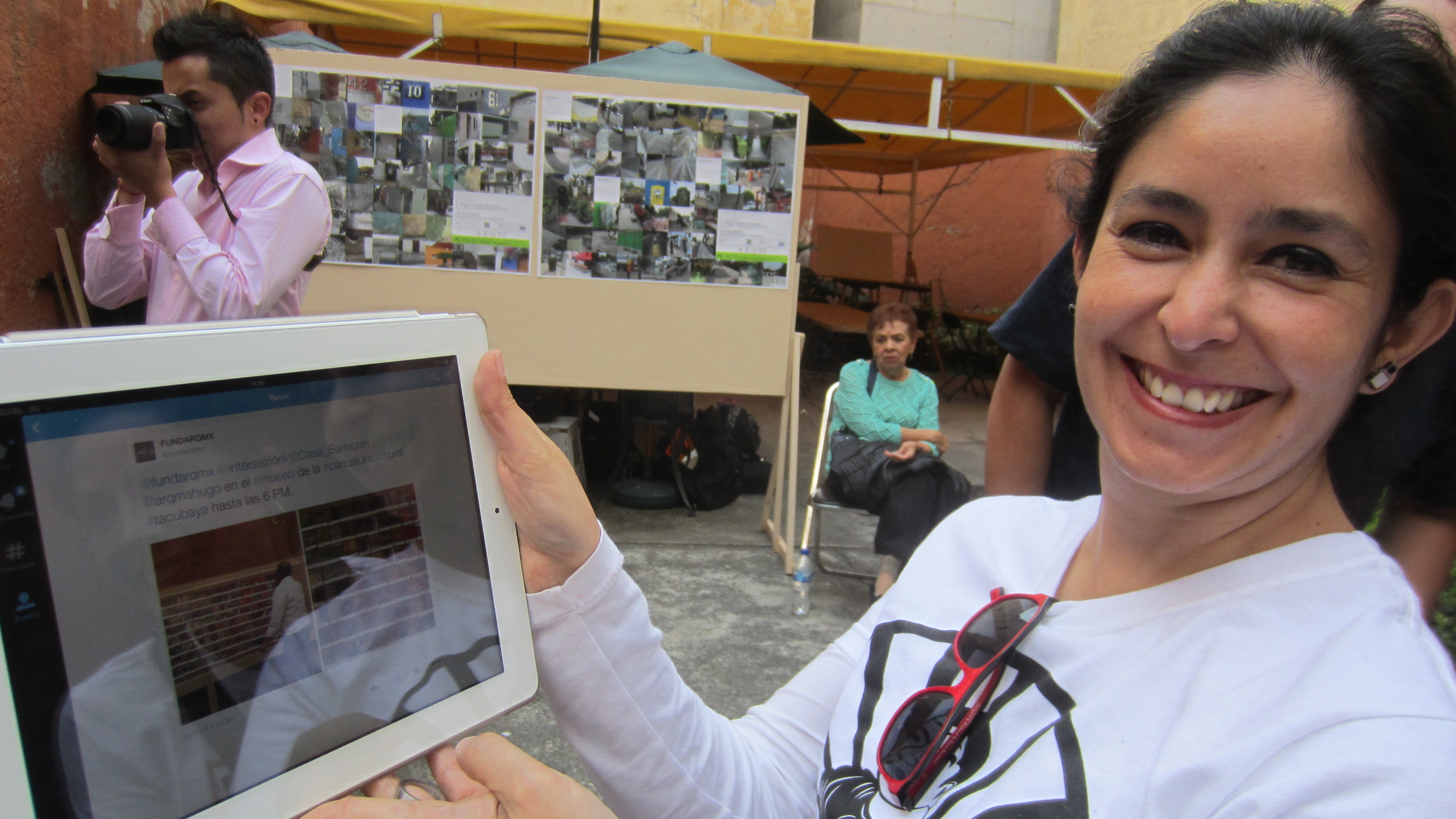
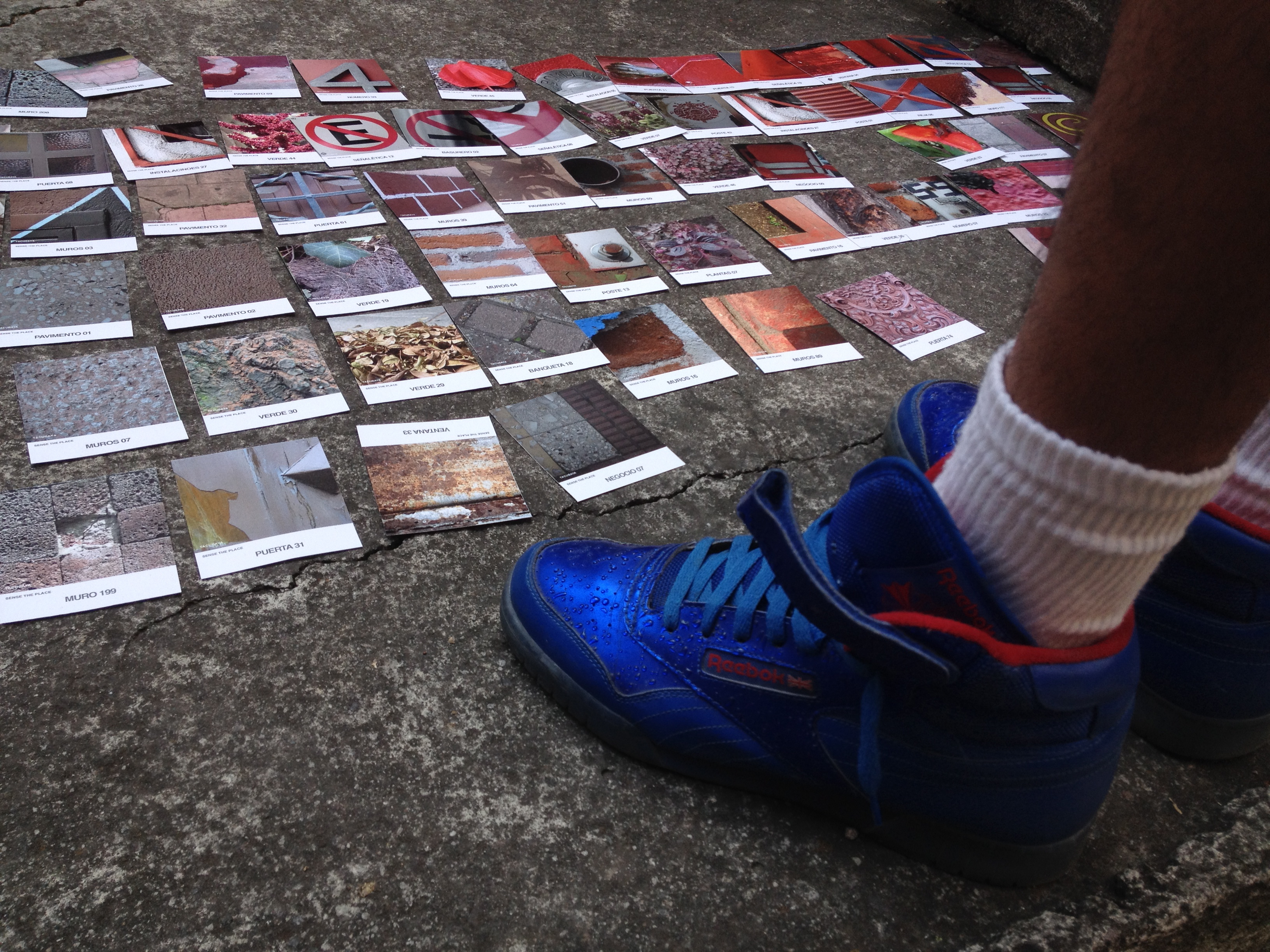
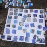
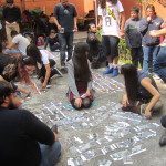
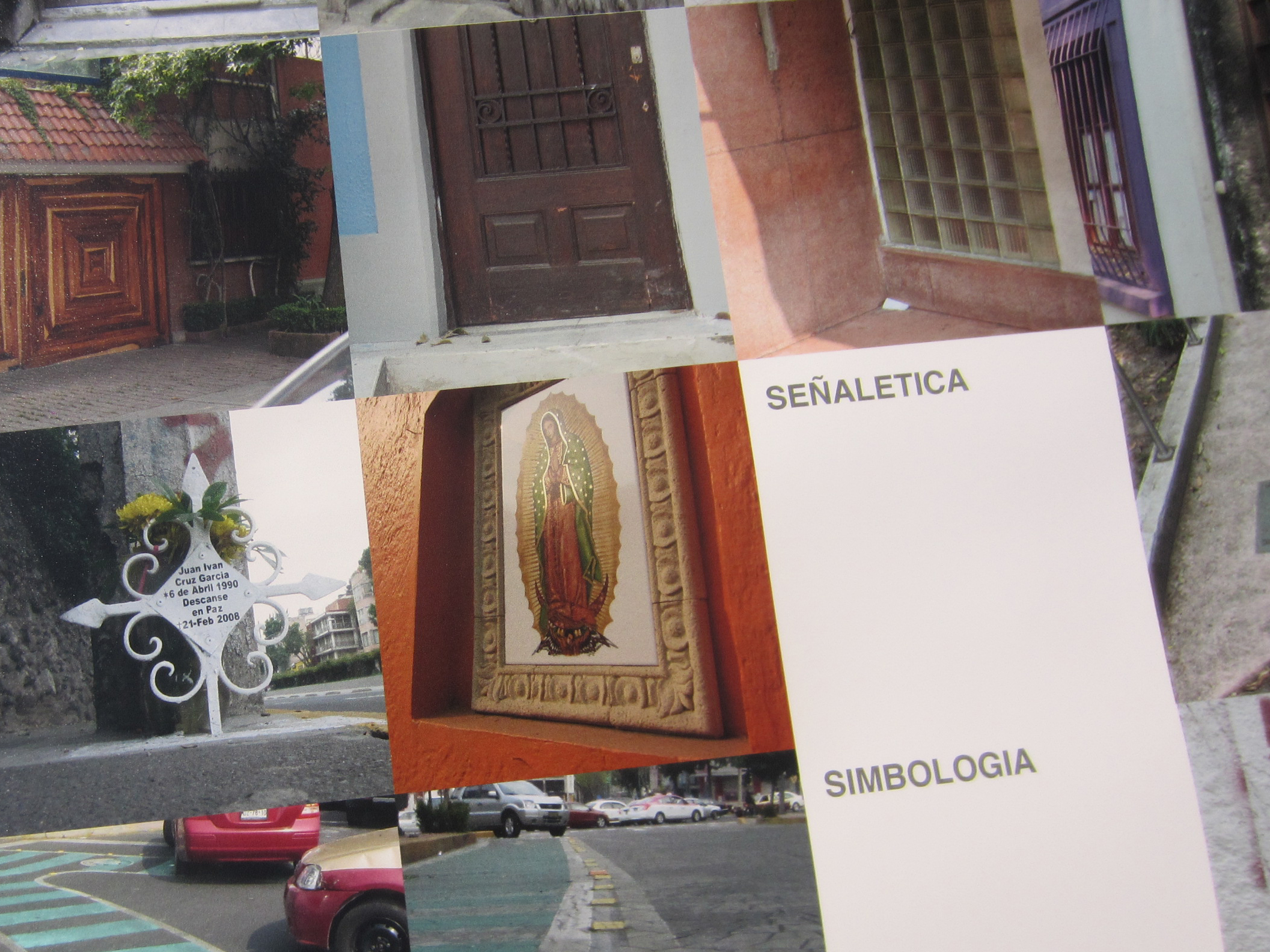
By the end of this mapping exercise the “map” was seven meters long and two meters wide. The result, which is made up of over one thousand 5cm x 5cm macro images, revealed a colour scheme that is prevalently made up of a greyish beige background that is interspersed with flashes of bright colours coming from small objects such as utility poles or road signs.
There is a strong component of shades of brown and green, the colour that was typically used to decorate the façades of clinker buildings in the ’70s, and also of shades of grey, from the local “Ceppo Lombardo” stone used in the lower sections and the lower floors of building façades. There are also shades of yellow used in façade plastering material, the light shade of yellow of traffic lights, dark green utility poles and clocks and light green rubbish bins. There is red coming from blocks of council housing of the ’40s, the pinkish red colour of cobbles and the shades of maroon of “Sanpietrini” paving cubes (so called after the paving cubes in St Peter’s Square in Rome).


In its complexity the map expresses a powerful and almost encouraging aesthetic dimension by blending in, unpredictably, the “noise” coming from the various artefacts with a background made up of building façades and shades of grey, thereby interpreting, almost literally, the true nature of the city of Milan.
The map is beautiful, and so is the city. Indeed the holistic view of the city’s hustle and bustle is beautiful; but the detailed view, however, is quite upsetting.


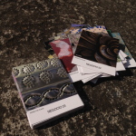
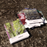
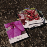
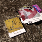
LABELING
Contest C_ i.e.: C_yellow_facade.jpg
Macro M_ i.e.: M_manhole.jpg
COLOR CHART CATEGORIES
Abandoned or lost
Water
Posters
Flower beds
Asphalt
Bitumen
Potholes and Patching work
Electricity Substations
Gates
Road-works
Cement
Waste Bins
Kiosks
Speed Bumps
Dispensers and Cabins
Windows
Façades
Gardens
Grilles and Grates
Fixtures
Mosses
Utility Poles
Paving
Plants
Weeds
Front Doors
Rust
Waste
Coatings
Shutters
Sedimentation
Public seating
Signs
Tubes
Vents and exhaust outlets
Manholes
Public Transport
Flower Pots
Vegetation
Shop Windows


 Swatch by swatch, color by color, detail by detail, shape by shape… finally the map started to reveal its incredible form.