Sense the Place got an article on Reppublica, one of the most influential newspaper in Italy

Sense the Place got an article on Reppublica, one of the most influential newspaper in Italy
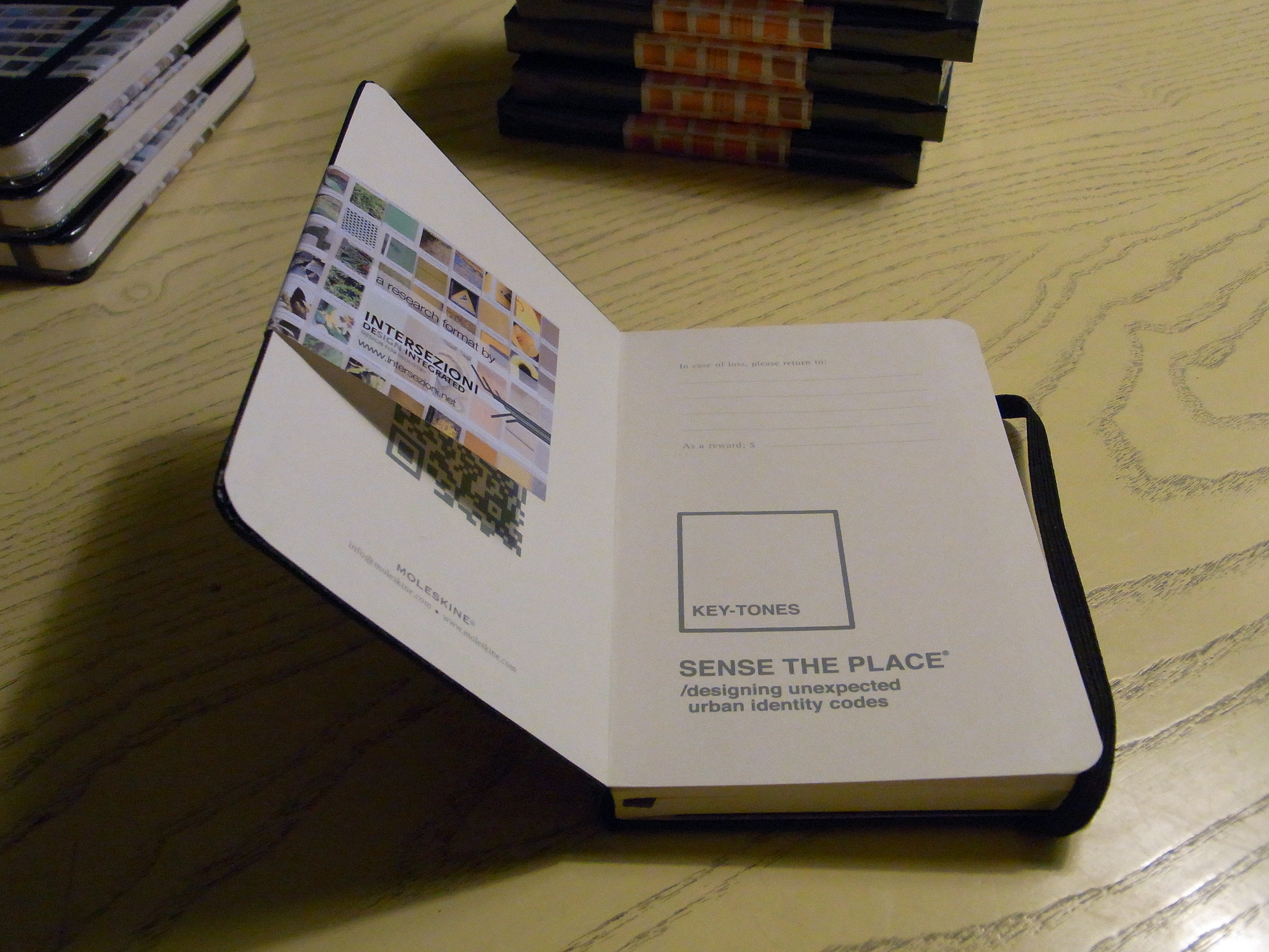
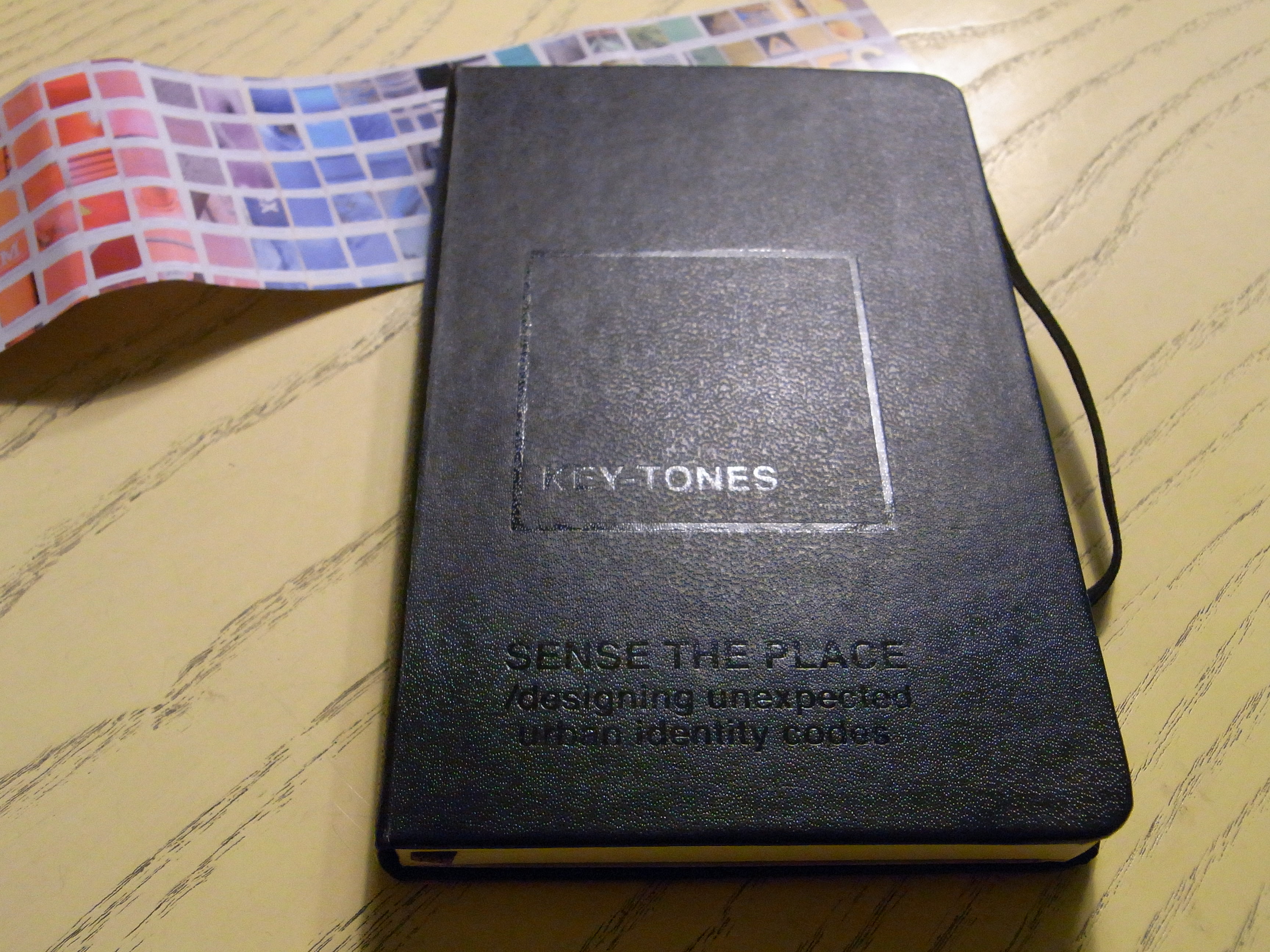
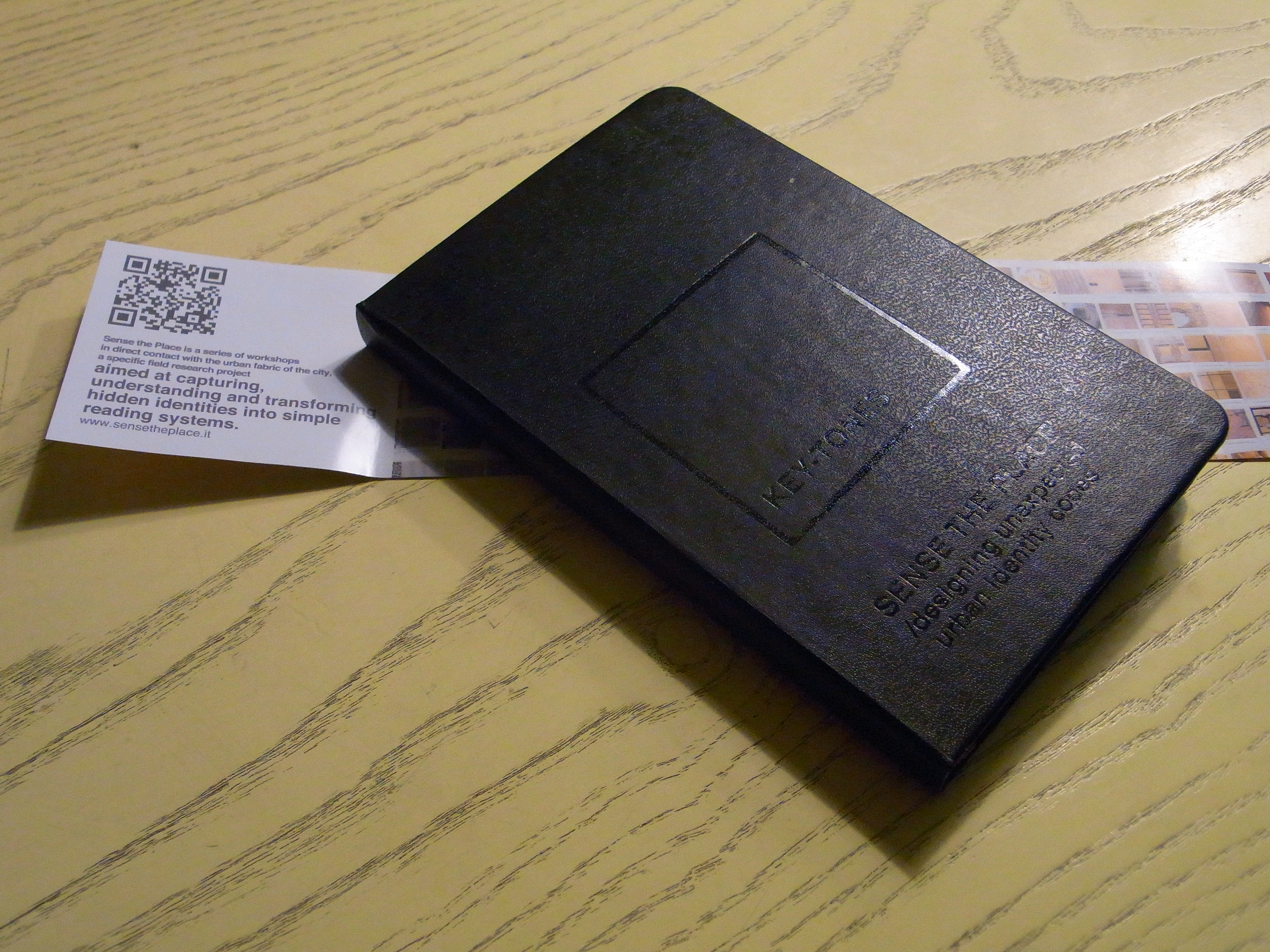
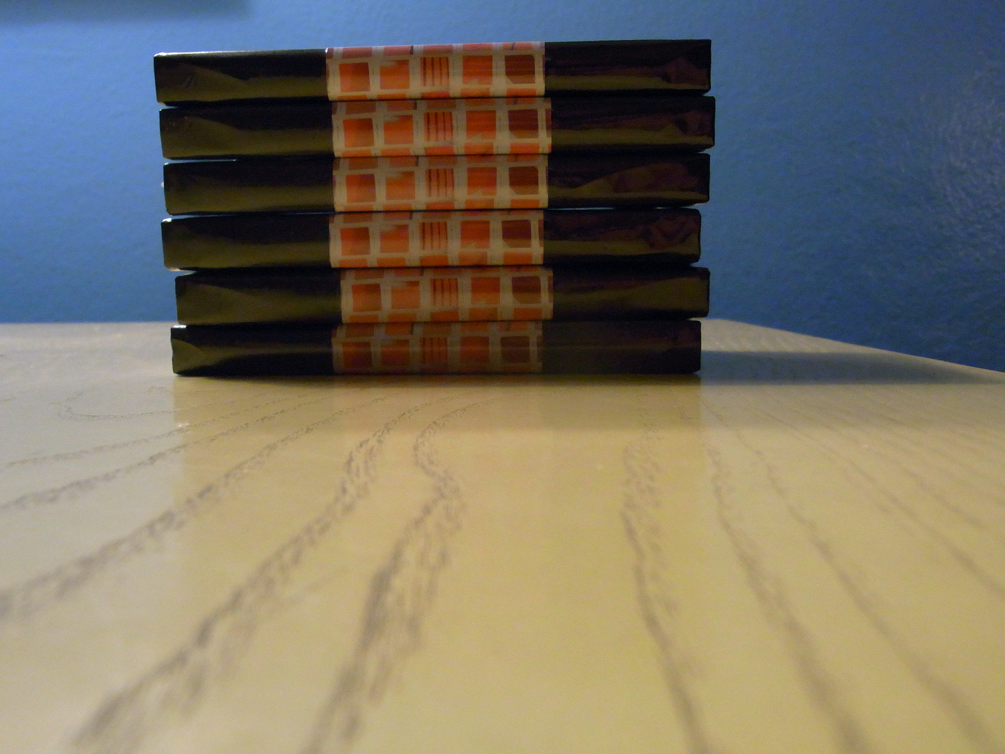
We now have a pocket sized Sense the Place thanks to Moleskine. From now on there will be an excellent tool for our future workshops.
www.moleskine.com/custom_editions/


text by Camilla Barone
The work put together by Sense The Place demonstrates a paradoxical perception of cities. Seen as a whole, the images depict the traces of our daily trails and routines, engraved in a city which nonetheless seems not to belong to us – seems, that is. Actually, if observed individually, one image at the time, every detail of those traces acts as a mirror which places us right there, in the midst of a Milan that we did not think we were part of. Rust on yellow metal, heels and moped prop-stands sunken into the tarmac, a myriad of ways of being disconnected from a Milanese pavement…
to read in full go to:
http://www.sensetheplace.it/stp-socio-semio-release/

text by Giorgio Chiarello, Architect
The term ‘sense of place’ has been defined and used in many different ways and could include geographic or environmental features of a specific location or a particular lifestyle, mood, meaning, or iconic perception related to it.
Certainly “sense of place” can be further declined at it’s minimum denominator where each person has his or her personal perception of a place that is, directly or indirectly, filtered by cultural background, age, sex, economic and social status, ethnicity, etc.. and definitively has to do with how we define the values and the meanings related to place and space. Therefore our own description of our place and other places is inseparable from our identity that undoubtedly is part of the dynamic interaction of relationships that develop between self, others and the contexts and these three key elements contribute to our sense of place.
Normally places that lack a ‘sense of place’ are considered “inauthentic” and this is probably due to the fact that they have a poor or no specific relationship to the local context. They could be anywhere as occurs for the majority of the fast food chains, shopping malls, rather than the petrol stations and the anonymous roadway infrastuctures that design the urban sprawl of our cities making them all dramatically look the same.
So if sense of place is what we are trying to define, “sense the place” clearly represents an open invitation to investigate the connotation processes that somehow lead to the necessary level of awareness and comprehension of the modalities of perception-understanding-description of the contemporary city, considered not only as a mere urban infrastructure or an agglomeration of functional spaces, but as a “place-in-progress” where interaction, socialization and regeneration processes continuously redesign it’s physiognomy.
The project can be defined a “experiential” cognitive mapping process that strategically recalls to use our 5 fundamental perceptional senses as “sensors”, sophisticated de-coding tools that, through images and colors, signs and sensations, sounds and noises, smells and aromas, textures and patterns, allow us to re-read and interpret the places we live in delivering us an extraordinary picture of the world that surrounds us and, probably, of ourselves.
gruppo OPLA+

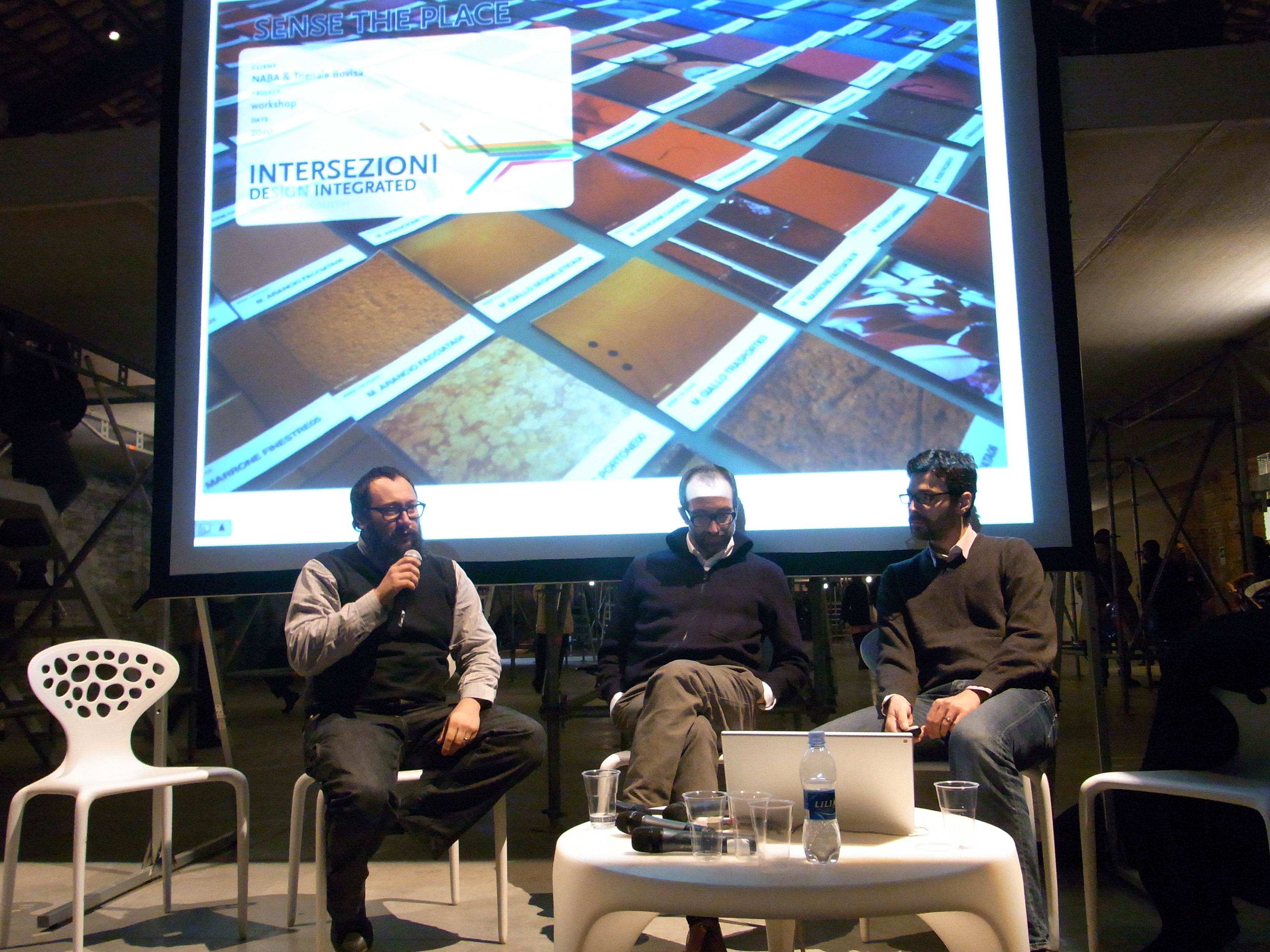
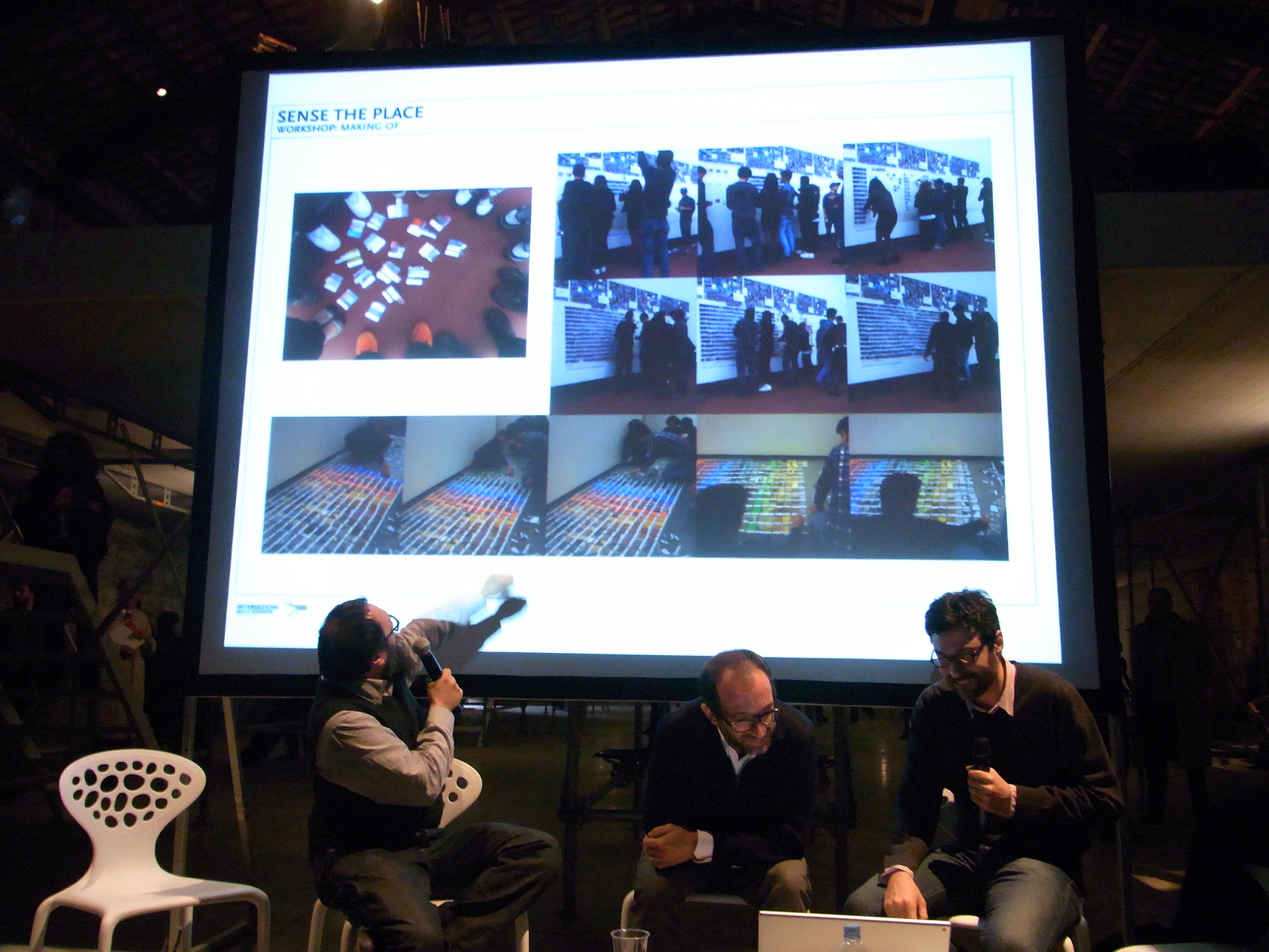
Venice Architecture Biennale – November 6th 2010. We were invited by the curator of the Italian Pavilion “AILATI”, Luca Molinari, to talk about “Sense the Place”.
The convention opens a window on contemporary architecture, pointing out possible solutions and future interpretations and highlighting the importance of Color as the “paste” and “content” of the architecture.


text by Luca Buttafava and Alessandro Confalonieri

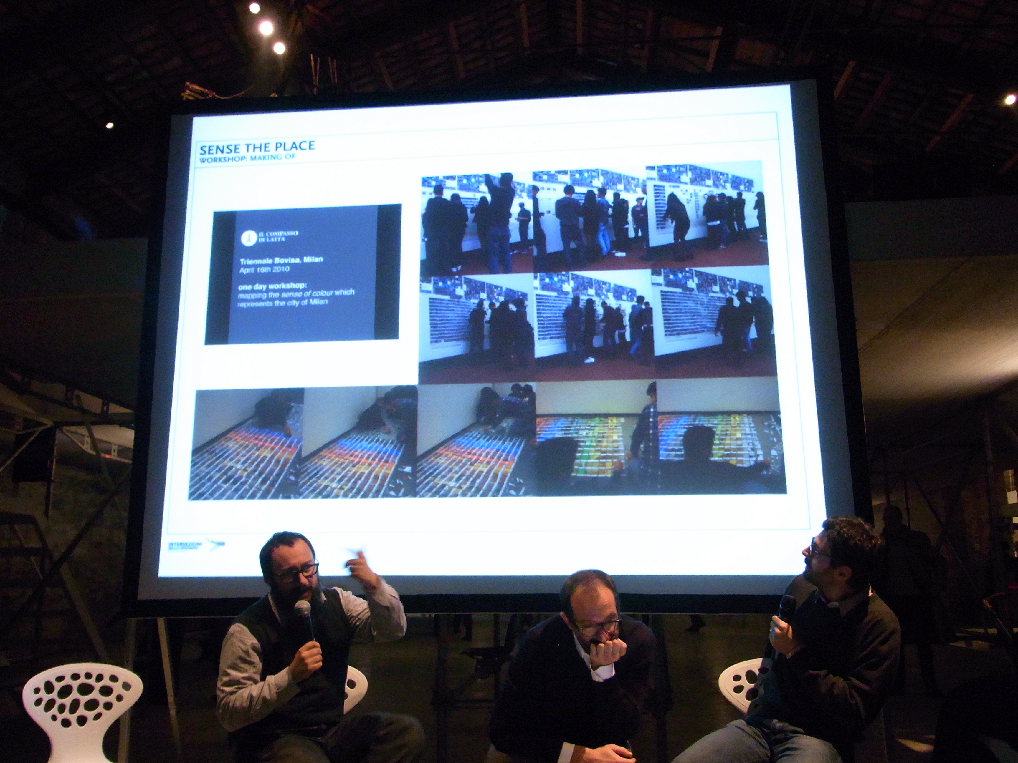
The group of students had three weeks to collect photographic observations from the field in order to document the colours of Milan.
Collection of Photographic material, analysis and final selection.
Participants documented each of their observations in its context and then photographed a fragment of the artefact in question, treating it as if it were a single pixel; two photos for each story. Taken as a whole, these “pixel” photos all add up to map out a colour chart of Milan.
Re-reading the research project and analysing it has lead us to define categories in terms of artefacts. Among the priorities, we set ourselves the objective of telling a story that made sense; we also set ourselves limits and established guidelines. A reasonable number of categories, very few but well focused shots, lots of feedback and a very selective process. We have removed many artefacts that were not visible at eye level or difficult to spot, along with cars that would have been overbearing, and individuals with their own identity. We have therefore given plenty of room for the architectural elements and consequently the city to express itself through its forms: from speed bumps to utility poles, from parks to melted asphalt with its accumulated recorded memory, and on to carved stones that are incorporated into other artefacts, and so on.


By gathering all this unique, concrete and accurate detail, a whole world was unveiled. The city reveals itself in an original way.
We had never realized to what extent urban space is relentlessly damaged. It is falling to pieces: the roads and the pavements, the flower pots, speed bumps and other objects, all manifest the state of their abandon, the general absence of being “looked after”, piecemeal projects that never get integrated with one another. There is no unique vision of how the city can or should come across. There is no vision of a physical Brand that represents the physical identity of the city. Milan is not only represented by the official graphics or its web portal, but above all it is represented by its “physical” self through its iconic forms, its materials, its details and through the coherence of its artefacts.


Along the roads you come across many objects that are either bent, rusted, piled up, jammed, tattered, or practically fossilized over time, as well as potholes, patching work, and so on. All this “noise” merges with traffic, movement, the frenetic mood of the people, and the force of the city’s architecture and all those distinguishing marks that characterize it. It is only through further analysis that a disjointed picture emerges laboriously. A picture that does not have a lot in common with the elegance of fashion, the genius of design and the beauty of architectural features that belongs to eras long past.


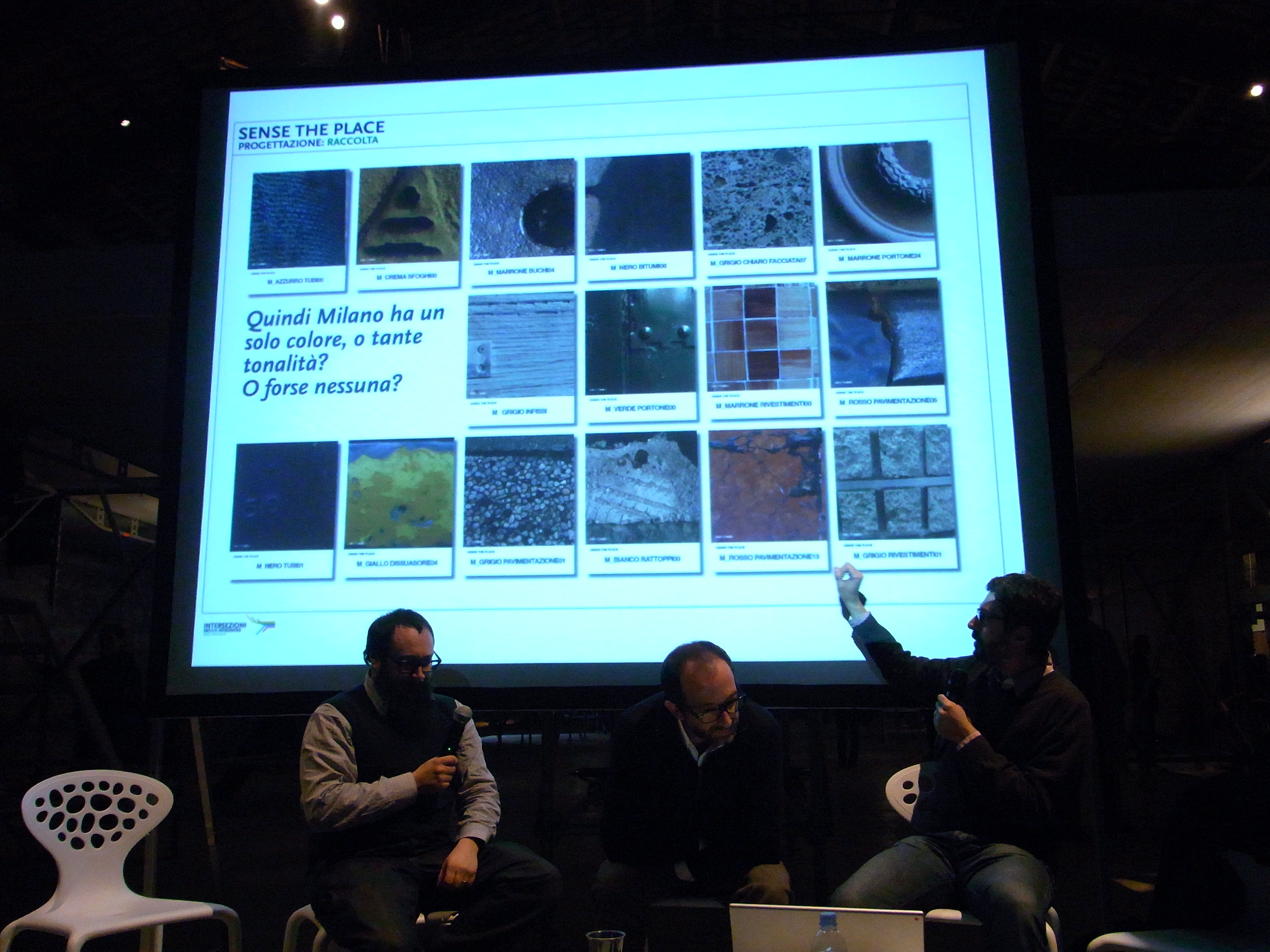
So does Milan have a single colour, or many colours?
Or perhaps no colours at all?
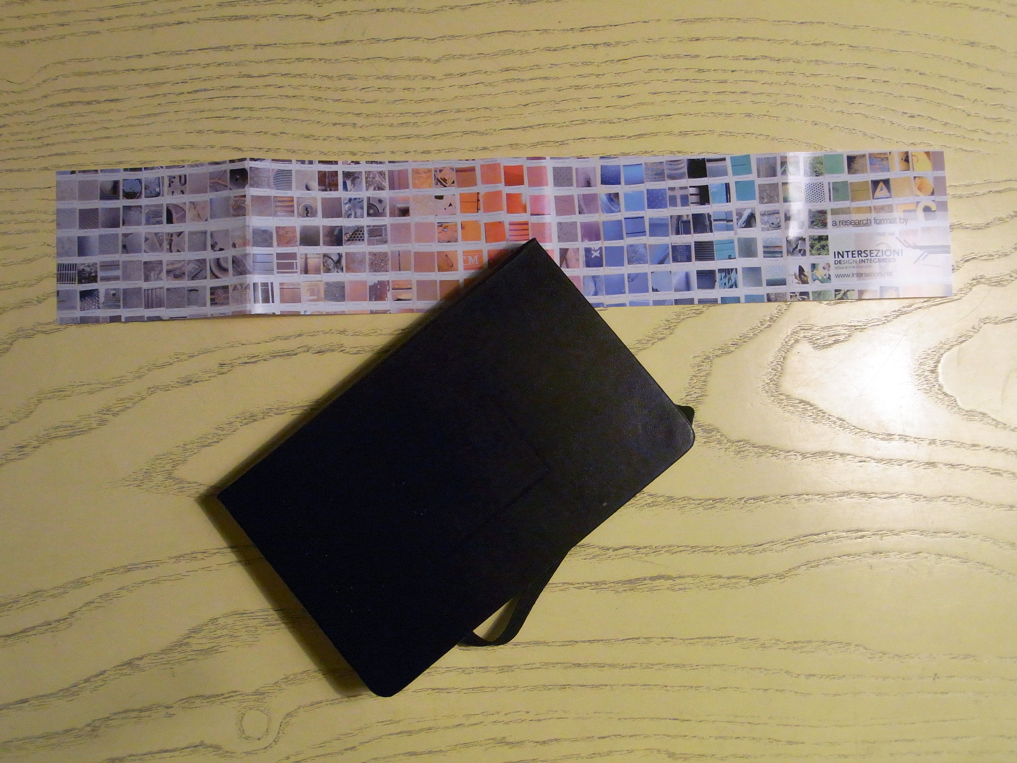
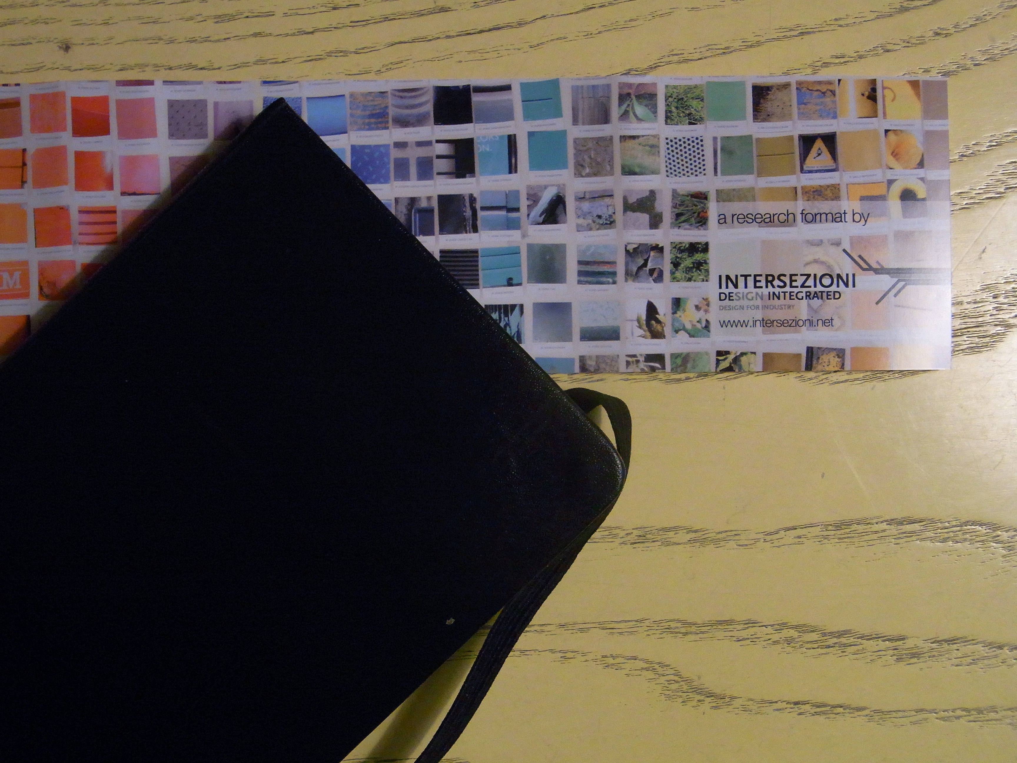
By the end of this mapping exercise the “map” was seven meters long and two meters wide. The result, which is made up of over one thousand 5cm x 5cm macro images, revealed a colour scheme that is prevalently made up of a greyish beige background that is interspersed with flashes of bright colours coming from small objects such as utility poles or road signs.
There is a strong component of shades of brown and green, the colour that was typically used to decorate the façades of clinker buildings in the ’70s, and also of shades of grey, from the local “Ceppo Lombardo” stone used in the lower sections and the lower floors of building façades. There are also shades of yellow used in façade plastering material, the light shade of yellow of traffic lights, dark green utility poles and clocks and light green rubbish bins. There is red coming from blocks of council housing of the ’40s, the pinkish red colour of cobbles and the shades of maroon of “Sanpietrini” paving cubes (so called after the paving cubes in St Peter’s Square in Rome).


In its complexity the map expresses a powerful and almost encouraging aesthetic dimension by blending in, unpredictably, the “noise” coming from the various artefacts with a background made up of building façades and shades of grey, thereby interpreting, almost literally, the true nature of the city of Milan. The map is beautiful, and so is the city. Indeed the holistic view of the city’s hustle and bustle is beautiful; but the detailed view, however, is quite upsetting.


LABELING
Contest C_ i.e.: C_yellow_facade.jpg
Macro M_ i.e.: M_manhole.jpg
COLOR CHART CATEGORIES
Abandoned or lost
Water
Posters
Flower beds
Asphalt
Bitumen
Potholes and Patching work
Electricity Substations
Gates
Road-works
Cement
Waste Bins
Kiosks
Speed Bumps
Dispensers and Cabins
Windows
Façades
Gardens
Grilles and Grates
Fixtures
Mosses
Utility Poles
Paving
Plants
Weeds
Front Doors
Rust
Waste
Coatings
Shutters
Sedimentation
Public seating
Signs
Tubes
Vents and exhaust outlets
Manholes
Public Transport
Flower Pots
Vegetation
Shop Windows


A series of workshops in direct contact with the urban fabric of the city of Milan, to observe the city through the 5 + 1 senses – a specific field research project – aimed at capturing, understanding and transforming hidden identities into simple reading systems. A true “design process” that can describe complex systems in terms of project communication codes, through the use of cognitive mapping.
Professional staff will accompany this project through a multidisciplinary approach based on information sharing. The point of departure for “SENSE THE PLACE” workshops is a colour mapping from where the project moves on to investigate those fonts that can best represent the city’s identity, its texture, its sounds, its smells, its tastes, its distinguishing marks, etc… These macro-categories, in turn, lead to in-depth reflections on contemporaneity, on communality, on day to day life, on people, and on all those things that surround us without being noticed, all of which are narrated in an unconventional way.
Design attitude: project relevance
5+1 senses of Milan
key-moods > sense the place
key-tones > sense of color
key-fonts > sense of sign
key-symbol > sense of mark
key-texture > sense of touch
key-vibes > sense of sound
key-smells > sense of smell
key-flavours > sense of taste
Moods = urbanity, sociality, usability, adaptability, people, places, scale, neighborhood, behaviors, habits, cultures, cultural-mix, diversity, fifty-fitty, 24h, paths, cityscapes, dynamism, temporary, dwell, permanent, journey, deliver, devices, tools, materic, stikiness, slippery, fragrances, smart grids, rumors, daily snatches, tone of voice, politics, benefits, deseases, noises, dirt, violation, provisions, trading, marketplace, producing, residual energy, expired, vital
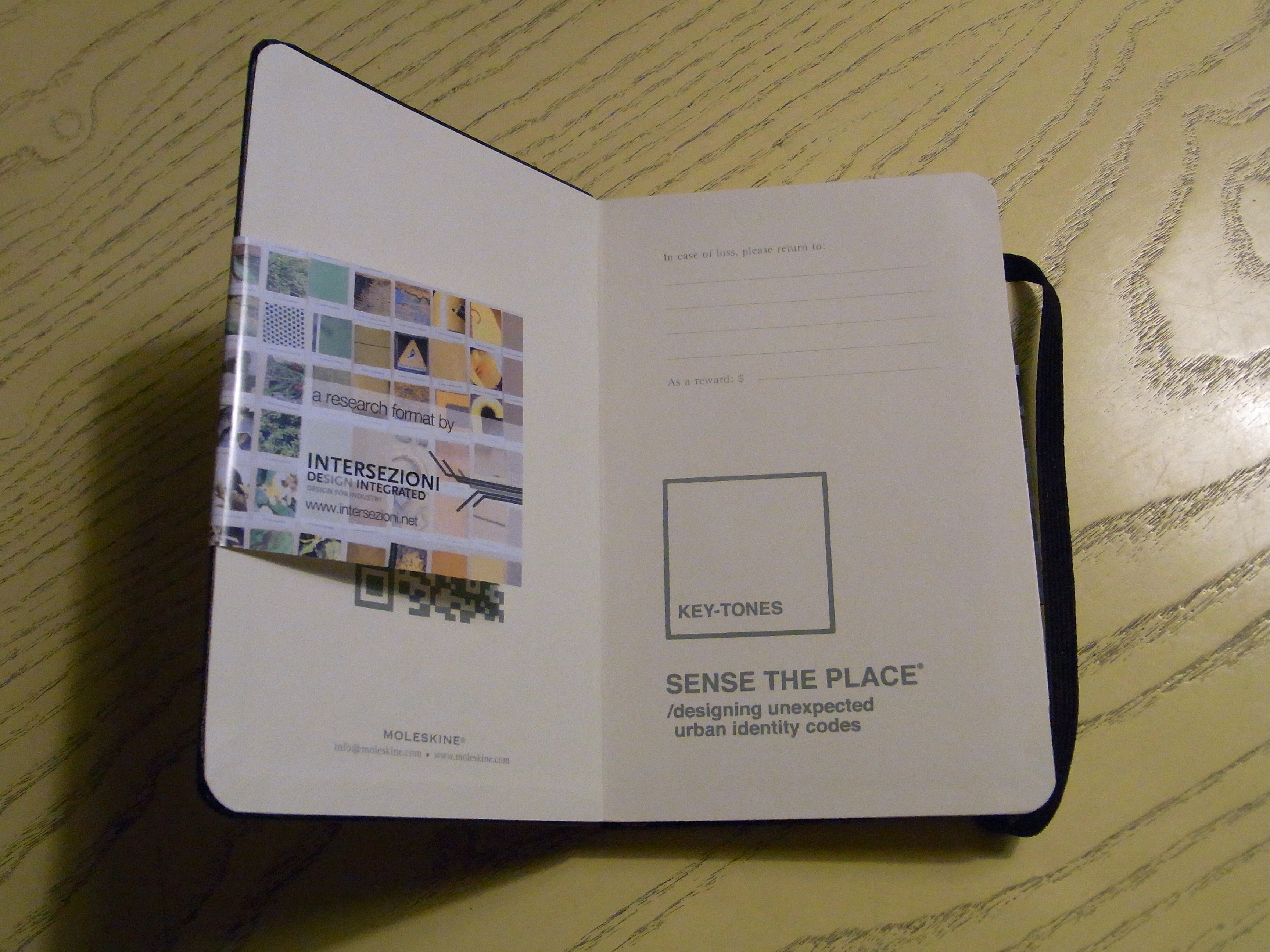
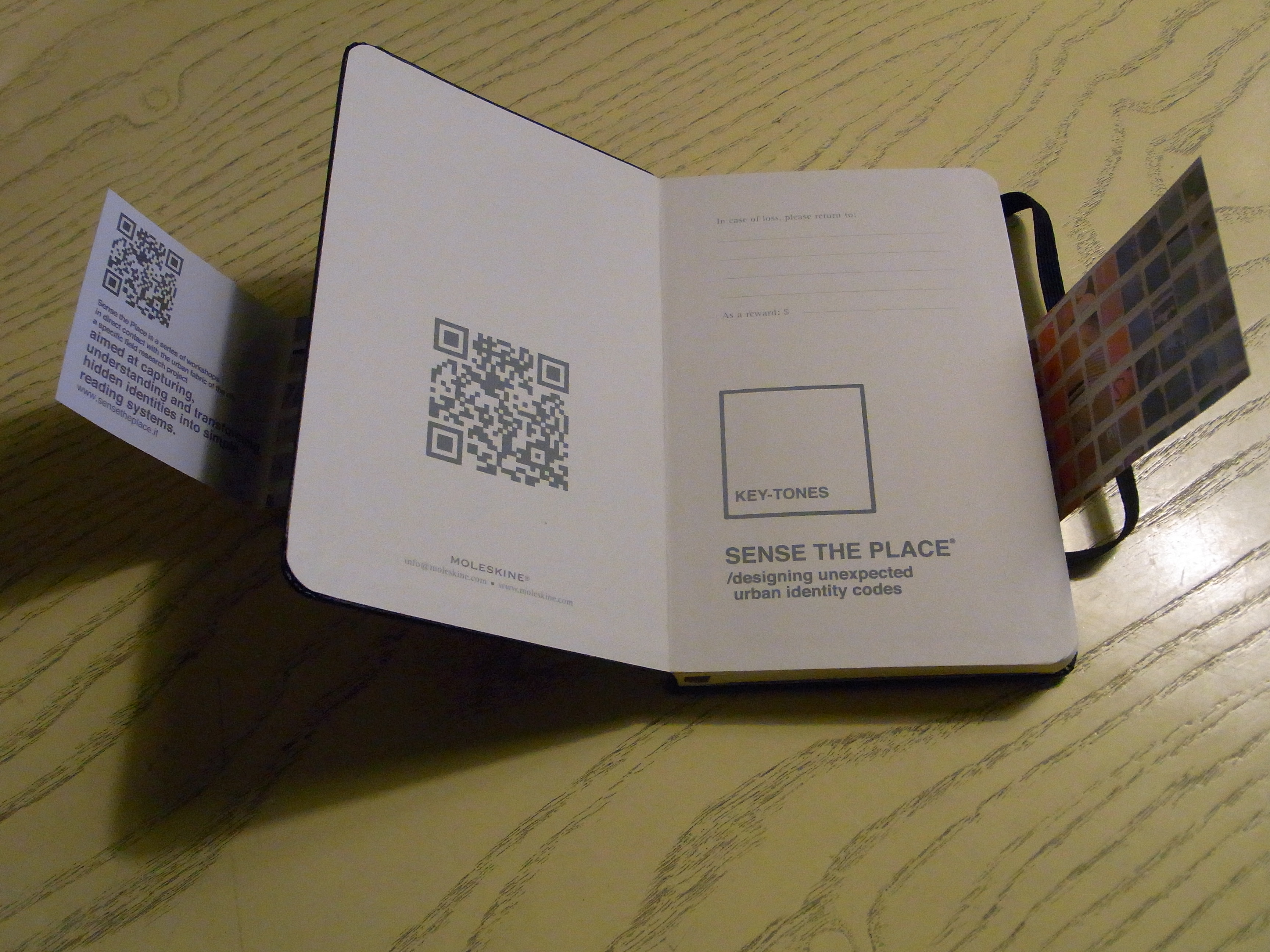
Key-tones
During the “Fuori Salone 2010″, at the “Triennale Bovisa” Museum in Milan, the two year “Product Design” course has worked on the Key-tones project. A meticulous photographic reportage on the urban identity of Milan aimed at identifying the colour code that best characterizes the city.
A map measuring 7 meters in length and 2 meters wide displays over one thousand macro details that are organized in a chromatic system that is similar to the language used by Pantone.

THE COLOR CODE OF MILAN
Creating the colour charts that define Milan.
What gives Milan its shades of green?
What gives Milan its shades of red?
What gives Milan its shades of purple?
What gives Milan its shades of magenta?
What gives Milan its shades of brown?
What gives Milan its shades of white?
What gives Milan its shades of black?
What gives Milan its shades of grey?
What gives Milan its darker shades of blue?
What gives Milan its lighter shades of blue?
What gives Milan its shades of orange?
What gives Milan its shades of yellow?

_FOREWORD
The “SENSE THE PLACE” series of Workshops was part of a project to start a two year specialization course in Product Design at the “Nuova Accademia di Belle Arti” (NABA) (New Academy of Fine Arts) that took place between 2009-11. Initially the intention was for these workshops to be an observatory for the city of Milan in light of the 2015 Expo and then become a FORMAT for colour coding cities in other countries. These workshops adopt the design philosophy of the course which makes use of Design as a process and research as a mechanism for investigation to collect and process cultural content in cognitive maps.
This platform, which is an INTERSEZIONI‘s format, serves as an opportunity to bring together professionals, students, researcher, architect and designer in order to start a dialogue and a series of cultural reflections that will then be broadcast and distributed through blogs and publications.
MA in Design Product at NABA 2009-11
Introduction: the multidisciplinarity of contemporary design
The classic definition of design as a discipline tied to objects and to the intuition of the single designer that develops “the object” together with the visionary entrepreneur is now outdated.
Design was redefined according to the complex dynamics of an evolving society, which learnt to consume and use not just objects, but entire families of products and services tied to the objects themselves.
Nowadays, to design means to be aware of and take into consideration complex processes that tie products to services. Those processes meet the requirements and behaviors – less and less conventional ones – of fast-paced communities used to fast changes, very long or extremely short days, changing and never linear modes.
The relationship between creator (who designs) and producer (who produces) was reconfigured in a wide design environment that often involves actors that are internal or external to the company, with the common objective of interpreting users needs and translate them into actual ideas and experiences.
The product is now part of a wider vision, including all the modalities a company uses to communicate and represent itself. Its image, recognizability, and brand appearance, are expressed in the product as the values that lead people to recognize themselves with a specific brand and identify in it behavioral systems they long for.
Starting from Design as a multidiscipline, the two-year program focuses on User Centric dynamics that investigate real Man-Man, Man-Object, Man-Space and Man-Service interactions through the practice of daily life activities. The program aims to provide designers the flexibility and open-mindedness needed to analyze complex processes and create opportunities, in order to create effective solutions to the issues presented by the current market.
Educational philosophy: learning in a community
The two-year specialization program in Product Design aims to help students to become design professionals capable of offering a high level cultural flexibility and excellent decision making ability, and to choose and develop complex systems related to spaces, products, and services.
The program emphasizes the strong relations between physical space and the students’ academic life: the majority of the activities take place in the same space, in which students closely work and live. The ability to share both personal and professional aspects of daily life creates a strong bond with the space and the environment in which the young designer sets the basis to become a real professional. It is a defined and recognizable place that allows to feel part of a community, within which information and experiences can be shared in a constant flow of mutual exchanges: workshops, labs, discussions.
The room becomes a real studio, in which the professor supports the student in the project development and discussion. The relationship generated within the studio is one of discussion/observations between experienced professional and young designer, rather than a classic professor-student relationship.
